Revolutionizing Hydraulic Fracturing Simulation
Industry
Oil & Gas
Client
LinqX
Service
Product
Date
2025
FracPro LiveX: Revolutionizing Hydraulic Fracturing Simulation Through Intelligent Design
Working Team
Stakeholders: Igor, Deepak, Stalian, and Daal
Lead Product Designer: Brahmjit Singh
Product Designer: Harish Sharma
Business associate: Priyanka Raghuvanshi, note-taking ticket management for the developer
Product Manager: Rishabh and Pulkit. They defined the business scope and roadmap.
Petroleum Engineers (SMEs): Deepak Gusain provided domain logic and physics validation.
Data Scientists: Vijay Deepak & Meghna developed the predictive AI models.
Frontend/Backend Engineers: React.js implementation and real-time socket handling.
QA Specialists: Priya and Shantanu ensured data accuracy in overall simulations.
My Role
As the lead product design strategist, I owned the end-to-end design lifecycle. My responsibilities included auditing the legacy system, facilitating workshops with petroleum engineers to understand complex workflows, defining the information architecture, creating the design system, and delivering high-fidelity production assets.
Overview
FracPro LiveX is an enterprise-grade hydraulic fracturing simulation platform. It allows engineers to design, simulate, and monitor the fracturing process to optimise oil and gas recovery.
The existing legacy solution was powerful but suffered from a "Windows 95"-era interface that was cluttered, disjointed, and difficult to learn. The redesign aimed to transform this into a modern, web-based SaaS platform that leverages AI to predict fracture geometry, reducing risk and improving operational efficiency.
How the Industry Works (Simple Explanation)
To understand the UX challenge, one must understand the domain hierarchy:
Pads: The surface locations where multiple wells are to be dug, with the perimeter ready and equipment set up.
Wells: The location where L-shaped wells are dug.
Casings: Cement and various chemical casings are poured layer by layer, with steel pipes inserted into the well to stabilise it.
Stages: The well is divided into smaller sections (stages), which are "fractured" one by one.
Why Simulation Matters: Before pumping millions of gallons of fluid and sand (proppant) into the ground, engineers must simulate the pressure. If the simulation is wrong, the rock won't break correctly, leading to millions of dollars in wasted investment and a bigger risk of safety hazards.
User Personas & Archetypes
To ensure the redesign moved beyond just "looking good" to actually "working well," we focused on three primary archetypes. These personas were validated through 10+ stakeholder interviews:
Before defining, we had a few questions to understand better and to ensure these personas are 100% accurate to the project experience:
Trust Levels: Is "Marcus" (the field guy) skeptical of the AI? (Often, field engineers hate "office AI" telling them what to do?
Collaboration: Do Sarah and Marcus talk within the app? Or do they use email/phone? (This decides if we need a "Comment or a Chat module" feature in the designs.)
Data Science used: Is there a specific "Data Scientist" user who tweaks the AI and simulation models based on comparing wells, or is that done on the backend by the dev team?
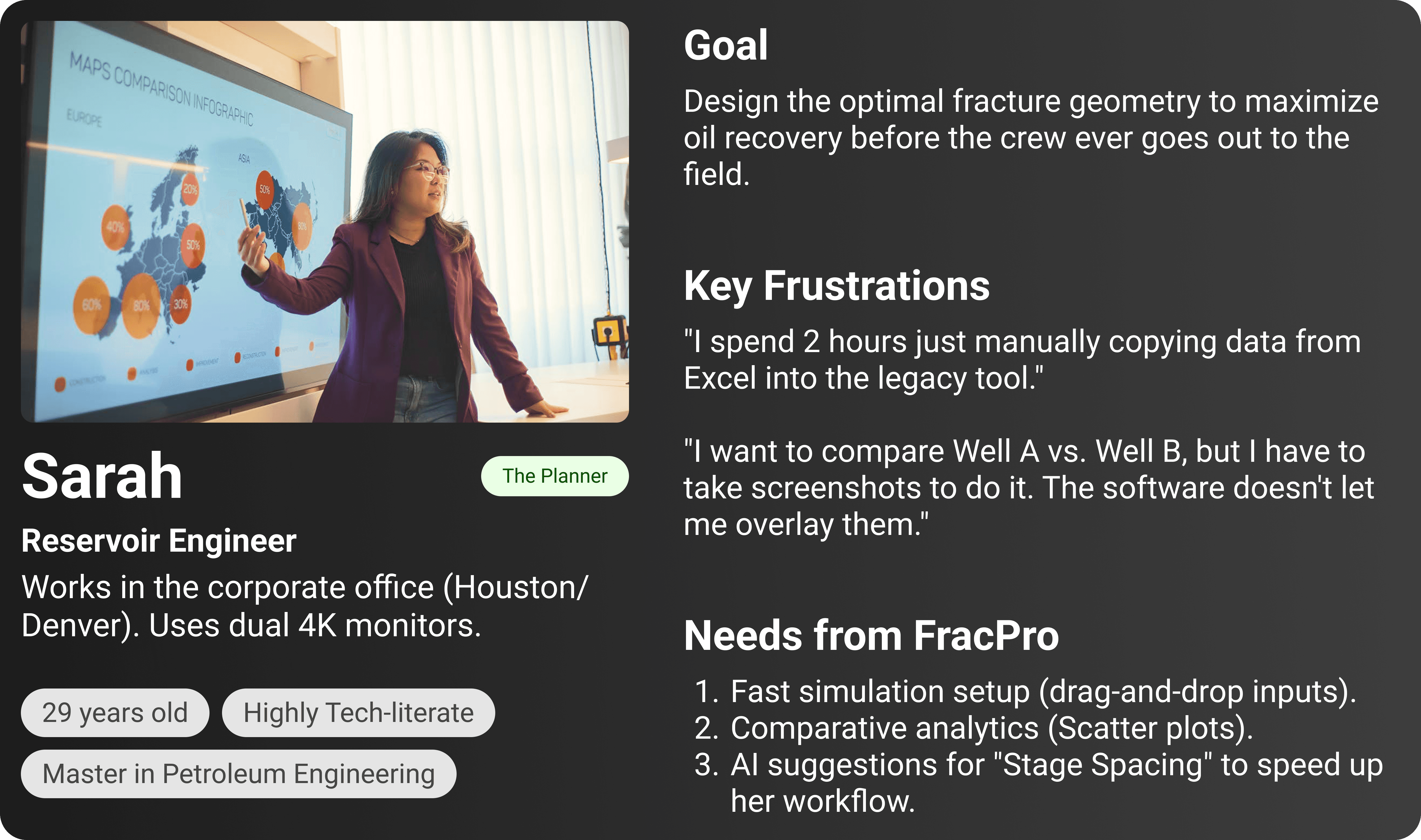
Persona 1:
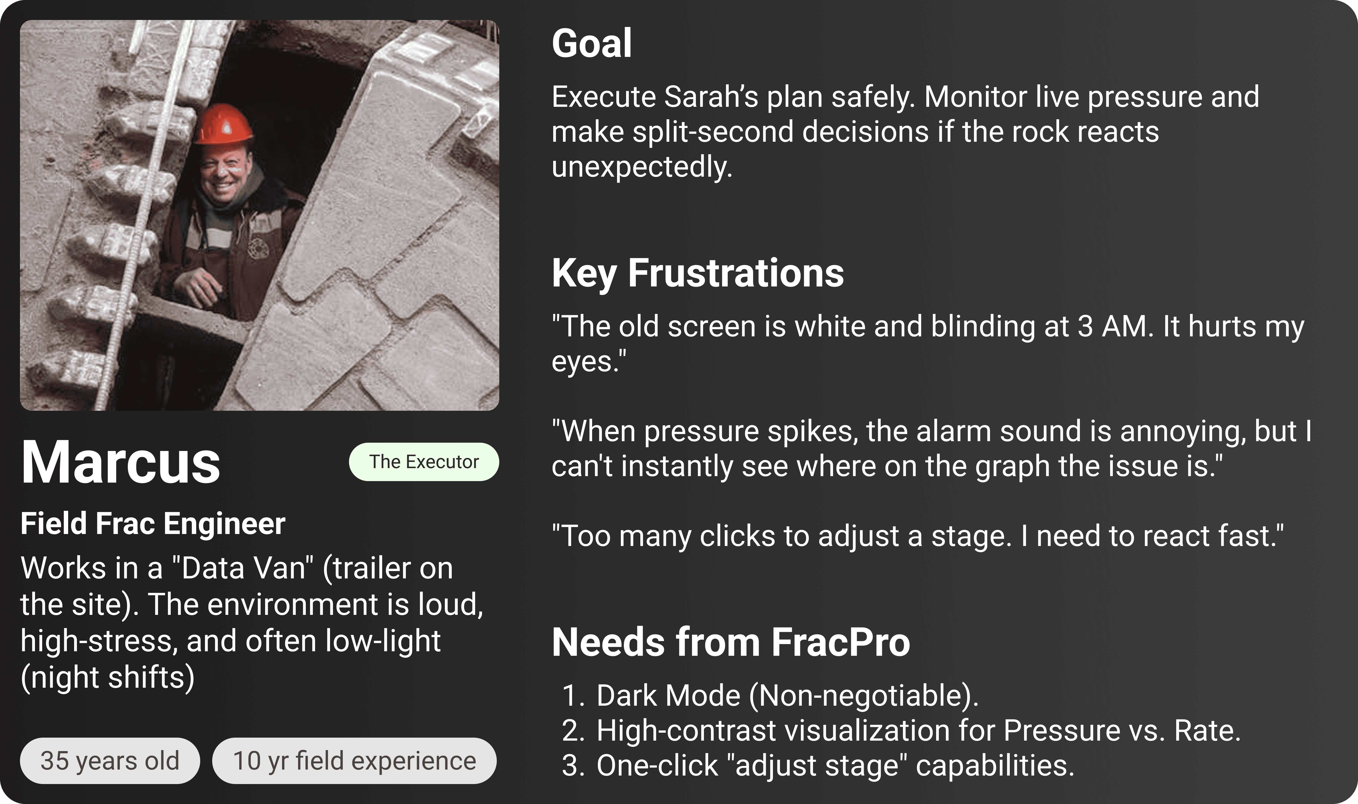
Persona 2:
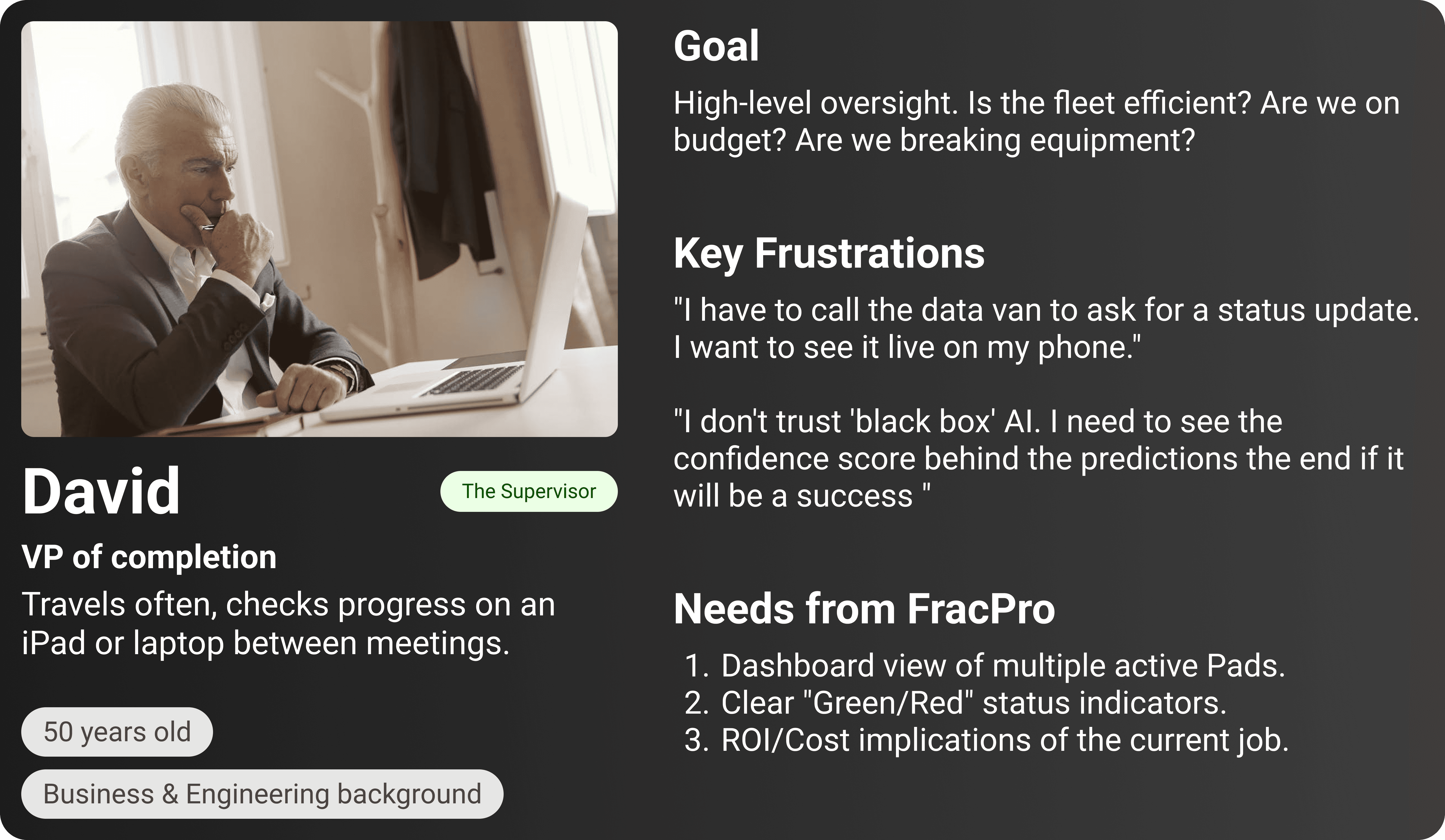
Persona 3:
Problem Identification
Upon auditing the legacy system, several critical issues emerged:
Cognitive Overload: Critical data (pressure, Rate, Concentration) was buried in nested tabs.
No Visual Hierarchy: Alerts looked the same as general text.
Disconnected Workflows: Users had to memorise data from one screen to input it into another.
Lack of Real-Time Feedback: The old system was static; it didn't effectively visualize live pumping data.
Business Problem
The poor UX was directly impacting the bottom line:
Investor Confidence: The outdated UI made the advanced AI algorithm "feel" untrustworthy to stakeholders.
Operational Risk: A high cognitive load increased the likelihood of manual input errors during critical stage designs.
Slow Turnaround: Engineers spent 40% of their time wrestling with the UI rather than analysing well performance.
Objective
User Goal: Reduce the time to design a simulation stage by 50% and provide clarity during real-time monitoring.
Business Goal: Transition from a desktop license model to a scalable cloud SaaS product.
Tech Goal: Visualise AI predictions for fracture geometry in real-time with graphs and a plotting mechanism
The Process We Followed
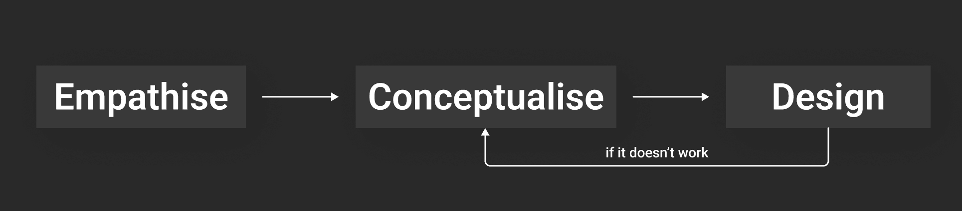
Empathise:
Conducted 10+ interviews with reservoir engineers and frac managers.
Shadowed users during a "job" to see how they monitor pressure graphs under stress.
Mapped the full data schema from Pad down to Perforation Clusters.
Conceptualise:
Created a new Information Architecture (IA), flattening the navigation depth.
Prioritised features based on "Job Setup" vs "Live Monitoring" vs "Simulation."
Design:
Developed a dark-mode-dominant design system (optimal for low-light control rooms).
Built interactive prototypes to test all the user flows, starting with the "Well comparison, treatment comparison" flow.
User Interviews: Key Insights
"I don't need to see everything at once. I only need to see what's going wrong." — Senior Engineer.
"Comparing Well A to Well B is a nightmare currently. I have to take screenshots and put them in PowerPoint." — Reservoir Analyst.
"Dark mode is non-negotiable. We work in trailers with low light; white screens hurt our eyes."
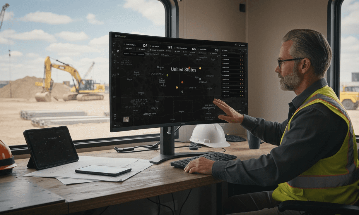
Information Architecture: The "Mission Control" Model
We realized early on that the legacy "file-folder" structure didn't match the mental model of a modern engineer. Users don't think in "files"; they think in Locations (Where), Actions (What), and Results (Why).
We restructured the platform into a relational ecosystem that mirrors the physical reality of the oilfield:
Level 1:
The Command Center (Map View). The entry point is no longer a blank slate. It’s a high-level operational view showing active pads, recent alerts, and pinned favorite pads for quick access.
Level 2:
The Physical World (Pads & Wells). We grouped assets by their geospatial hierarchy. Users select a Pad (the surface location) to reveal its associated Wells (the drilling points). This creates a clear parent-child relationship that was missing in the legacy tool.
Level 3:
The Execution Loop (Treatment) This is the "Doing" phase. Whether it's monitoring a Real-Time Treatment or uploading historical data, all execution tasks live here.
Level 4:
The Intelligence Layer (Compare & Analyze) Analysis isn't an afterthought; it's central to the workflow. We elevated Compare Wells to a primary module, allowing engineers to overlay historical "ghost" data against live jobs to predict outcomes.
Level 5:
The Engine Room (Settings & Admin): The foundation of the system. This houses User Management and the critical Channel Mapping engine, ensuring data consistency across the platforms like Live+, LiveX, CemManager, and XOPs
Quick Market & Competitive Study
We analysed competitors like FracPro, GOHFER, and StimPlan.
The Gap:
While these tools are physics-accurate, they lack modern usability. They require months of training to master.
The Edge:
None of them effectively integrated AI-driven predictive modelling in a user-friendly way. Most were purely physics-based calculators without "smart" suggestions.
Prioritisation & Strategy Creation
Using the MoSCoW method:
Must Have:
Real-time pressure plotting, robust hierarchy management (Pad > Well), dark mode.
Should Have:
Comparative analytics (scatter plots), AI confidence scores.
Could Have:
3D visualisations of the fracture (moved to Phase 2 due to technical complexity).
Opportunity
The redesign wasn't just a facelift; it was an opportunity to introduce Predictive UX. Instead of just showing data, the system could suggest the optimal pumping rate or warn if a stage was likely to "screen out" (clog) based on historical data from similar wells.
Strategy
UX Strategy:
"Progressive Disclosure". Show high-level health metrics first; allow deep diving into granular physics data only when requested.
Design System:
Create a bespoke library, utilising high-contrast neon accents (green/orange/red) against deep charcoal backgrounds for maximum readability of data visualisation.
User Task Flow
The primary flow we optimised was the Simulation Setup Loop:
Select Pad (Geo-location) → Select/Create Well (Define geometry) → Input Casing Details (Pipe specs) → Build Stage (Define fluid & proppant) → Run AI Simulation → Review Pressure Match (Compare AI prediction vs. Actual) → Finalize
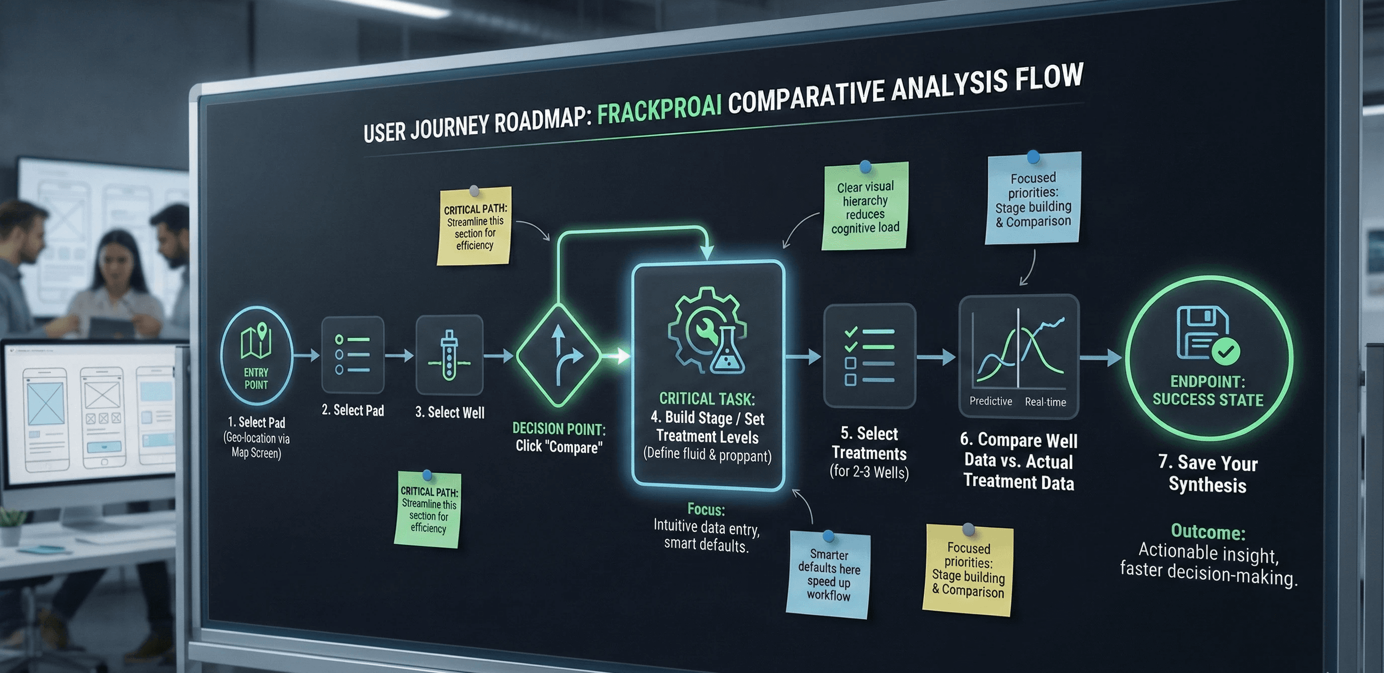
Design Rationale: Structuring for Speed
Our structural decisions were driven by a single metric: Time-to-Insight. We needed to reduce the friction between a user needing data and finding it.
1. Flattening the Navigation
Legacy tools often bury critical features inside nested dropdowns (e.g., File > Open > Simulation > Live). We moved to a permanent, collapsed Left Sidebar. This maximizes the horizontal screen real estate—crucial for viewing wide-pressure graphs—while keeping the primary modules (Wells, Treatment, Settings) reachable with a single click.
2. Contextual Analytics
Engineers rarely analyze data in a vacuum; they compare. Instead of hiding analytics in a separate "Reporting" silo, we integrated the Compare Wells interface directly adjacent to the well selection. This allows users to pivot instantly from "selecting a well" to "benchmarking its performance" without breaking their flow.
3. Solving the "Data Babel"
A major pain point was that different service companies call their sensors different names (e.g., "P_Pump" vs. "Treating Pressure"). We created a Channel Mapping interface within Settings. This acts as a "Universal Translator," standardizing incoming data streams so the AI—and the engineer—are always speaking the same language.
Structural decisions:
Global Navigation: Moved to a collapsed left sidebar to maximise screen real estate for graphs.
"Stage" Canvas: Created a horizontal timeline view for stage progression, replacing the old spreadsheet lists.
Compare wells/Padds: Designed a widget-based grid system allowing engineers to pin their "Favorite Pads" for quick access and save them for future analysis with all the customizations
Multiple Iterations
Iteration 1:
We tried a "light mode" approach. Result: Rejected immediately by field engineers. "Too bright for night shifts."
Iteration 2:
Complex 3D navigation. Result: Engineers found it cool but distracting. "Give me the 2D graph; that's where the truth is."
Iteration 3 (Final):
A data-dense, dashboard-style layout with collapsible panels to manage the complexity of data entry without leaving the main view.
Final Design - (*Prototype at the end)
The Well Manager (Digital Twin):
We created a structured, tabular view for "Well Details." This acts as the single source of truth for the well's physical properties.
Clean, tabular data entry for Well parameters. Note the clear distinction between 'General', 'Proppant', and 'Fluid' sections to reduce cognitive load.
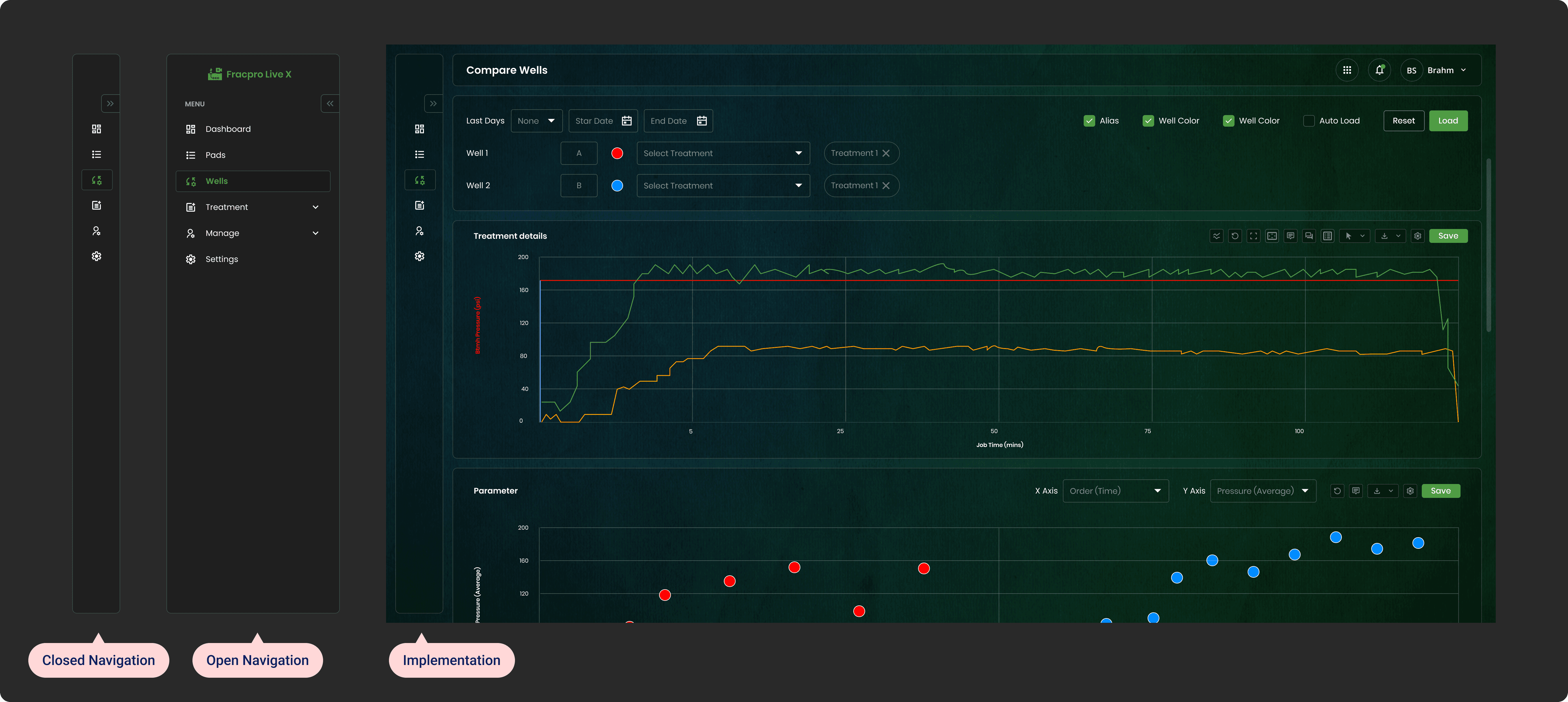
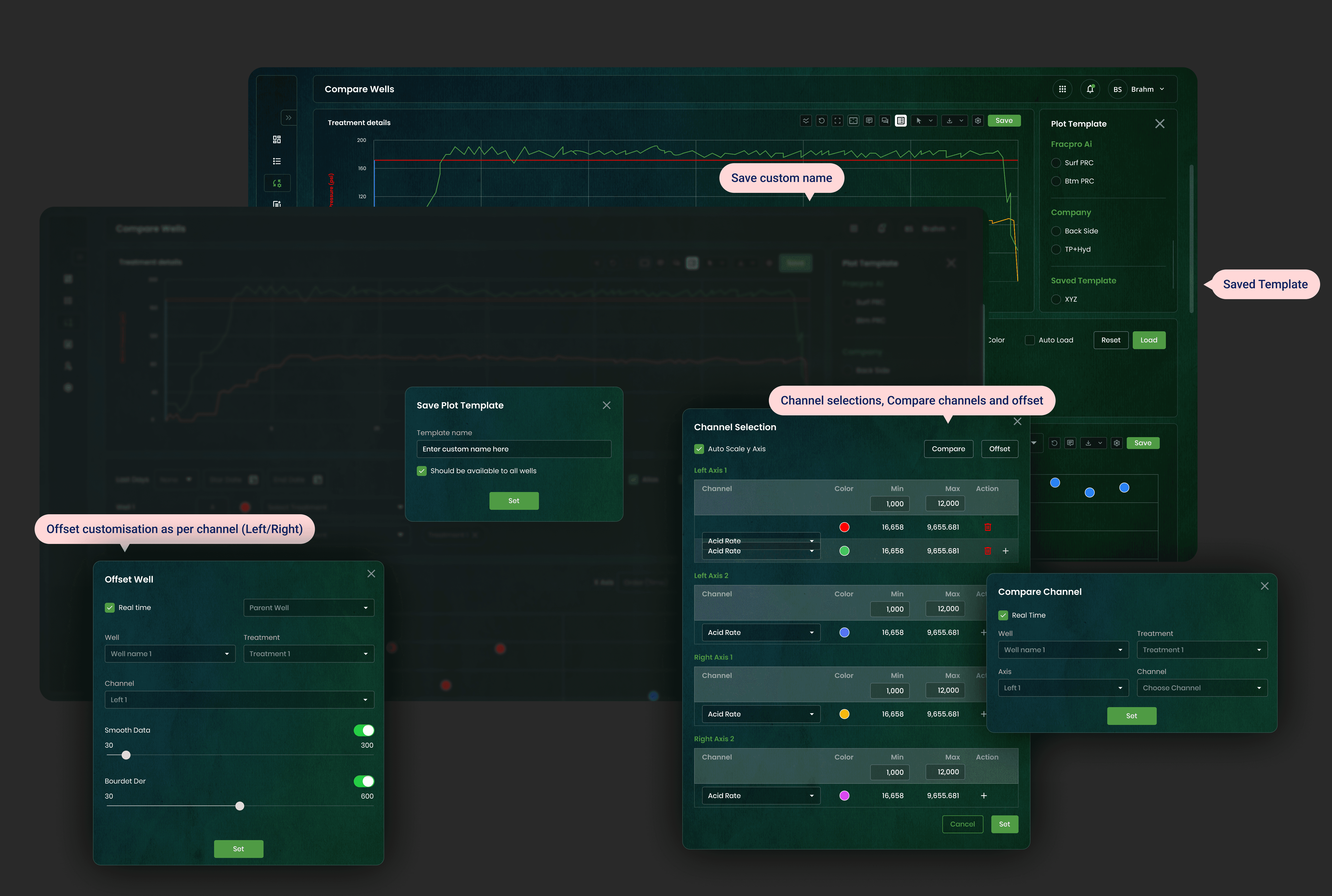
Real-Time Treatment Comparing:
This is the heart of the application. We dedicated 70% of the screen to the Treatments and adding/saving plots.
Visual Logic:
The X-axis represents time, while the dual Y-axes show Pressure (Psi) and Rate (bpm).
Colors:
We used standard industry colors —Green for Rate, Red for Pressure, and Yellow for Proppant Concentration, to ensure immediate recognition for legacy users, supporting the mental model.
Comparative Analytics
To solve the "PowerPoint problem," we built a native comparison engine. Users can now overlay performance metrics of different wells to identify trends. Figure 4: The 'Compare Wells' feature using scatter plots to correlate pressure averages against time, allowing engineers to spot outliers instantly.

The Treatment Detail screen. The graph visualizes the "heartbeat" of the fracture job. The top status bar clearly indicates the current active well.
Key Results
70% Reduction in time required to set up a new well simulation.
0 training required for basic monitoring features due to intuitive standardisation.
High Adoption: The "Compare Wells" feature became the most used analytics tool within 2 weeks of launch.
Reduced Errors: Form validation and smart defaults reduced input errors by significant margins.
Overall Impact
Business Impact
The redesign successfully positioned FrackProAI as a market leader. The modern interface helped secure contracts with two major operators who cited "ease of use" and "clarity of data" as their primary reasons for buying. It bridged the gap between complex physics and usable software.
Personal Learning
Designing for petroleum engineering taught me the value of humility in design. I learned that in technical domains, "pretty" comes second to "accurate." The best UX in this context wasn't about simplification (removing data), but about clarification (structuring data so it can be processed faster).
Designer Handoff
To ensure pixel-perfect implementation:
Tokenization:
We used Design Tokens for all colors (e.g., color-pressure-alert) and spacing.
Component Library:
Delivered a fully documented Figma library including states for "No Data," "Loading," and "Error."
Dev Collaboration: Weekly "desk checks" with developers to refine graph animations for smoothness and micro animation.
Key Learnings & Reflections
As a Lead Product Designer, this project was a masterclass in designing for high-stakes, technical environments. It pushed me to evolve not just as a visual thinker, but as a product leader.
On UX Strategy: Designing for the Expert Mind
Complexity ≠ Clutter: I learned that for domain experts, data density is actually useful if structured correctly. My initial impulse to "clean up" (add whitespace, hide data) was wrong. Chemical and frac engineers need density to spot correlations.
The lesson? Don't simplify the data; clarify the relationship between the data points.
The "Trust Gap" in AI: Designing the "AI Prediction" feature taught me that accurate algorithms are useless if the user doesn't trust them. We had to design "Confidence Scores" and "Explainable AI" tooltips.
I learned that UX for AI isn't about the result; it's about visualizing the 'Why' behind the result.
Context is King: The shift to a dark-mode-first system wasn't an aesthetic choice; it was an accessibility necessity for engineers working in dark data vans at 3 AM.
Reinforced that true empathy requires understanding the user's physical environment, not just their screen.
On Team Management & Leadership
Design as the "Universal Translator": My biggest value-add wasn't just pixels; it was bridging the gap between Petroleum Engineers (who speak physics) and Developers (who talk to React). I learned to facilitate workshops where wireframes became the common language that aligned these two distinct groups.
Leading Through Ambiguity: In a startup environment with shifting requirements, my role was to provide stability. I learned to create "flexible frameworks" (modular design systems) rather than rigid pages, allowing the team to pivot features without breaking the entire UI architecture.
Empowering SMEs: I realized early on that I couldn't be the expert in fracking. I shifted from trying to "solve" the problem myself to facilitating co-creation sessions with the engineers. This taught me that great leadership is often just knowing who in the room has the right answer and giving them the pen.
Interactive prototype coming soon:

