Global Nuclear Data Accessibility
Engineering Trust in Global Nuclear Data.
Transforming the IAEA's ARIS platform from a fragmented legacy system into a high-integrity, collaborative source of truth for 171 member states.
01. The Situation
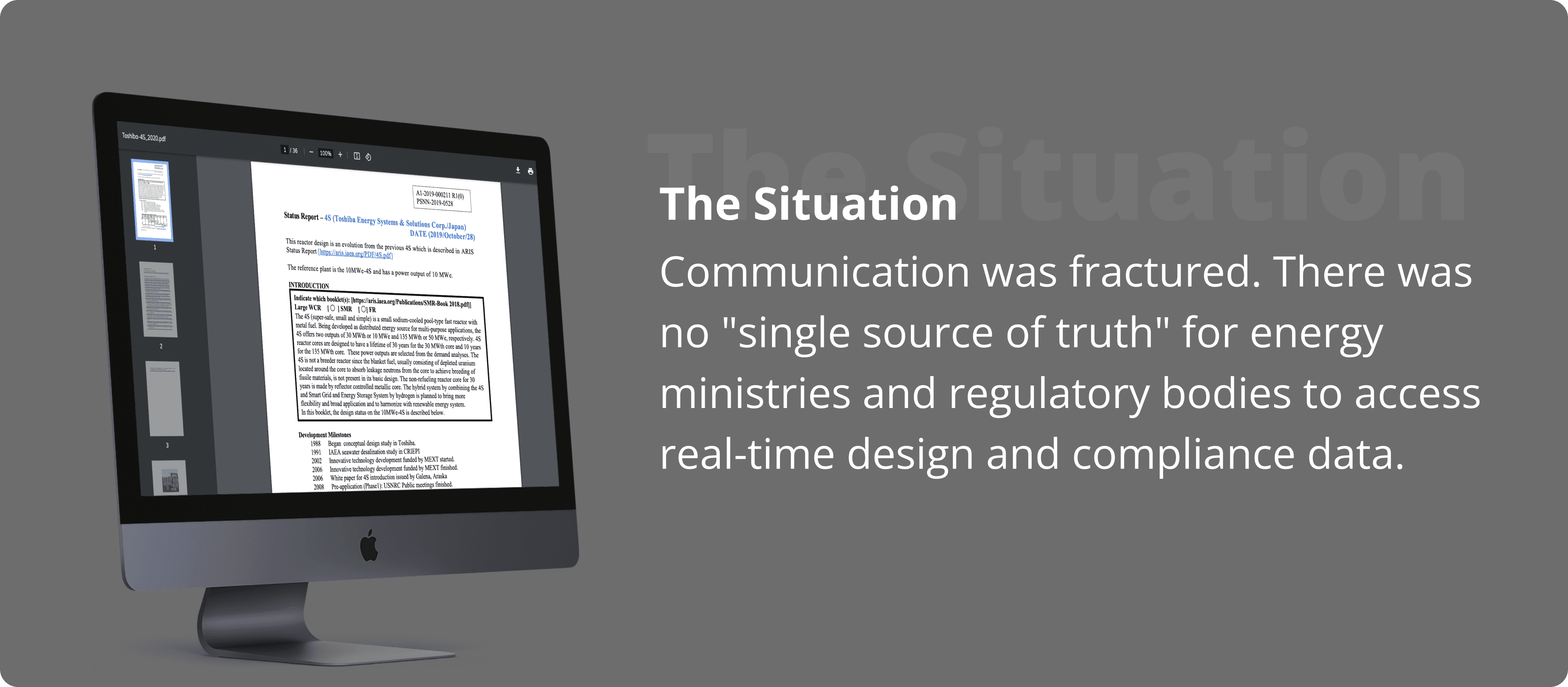
When data sharing fails, global energy policy hangs in the balance.
The International Atomic Energy Agency (IAEA) required a mission-critical digital ecosystem to manage advanced reactor data across 171 member states.
The existing process relied on manual email chains and static PDFs, creating massive challenges regarding data redundancy and audit risks. Stakeholders were drowning in version chaos, where scientific documentation was disconnected from the review process.
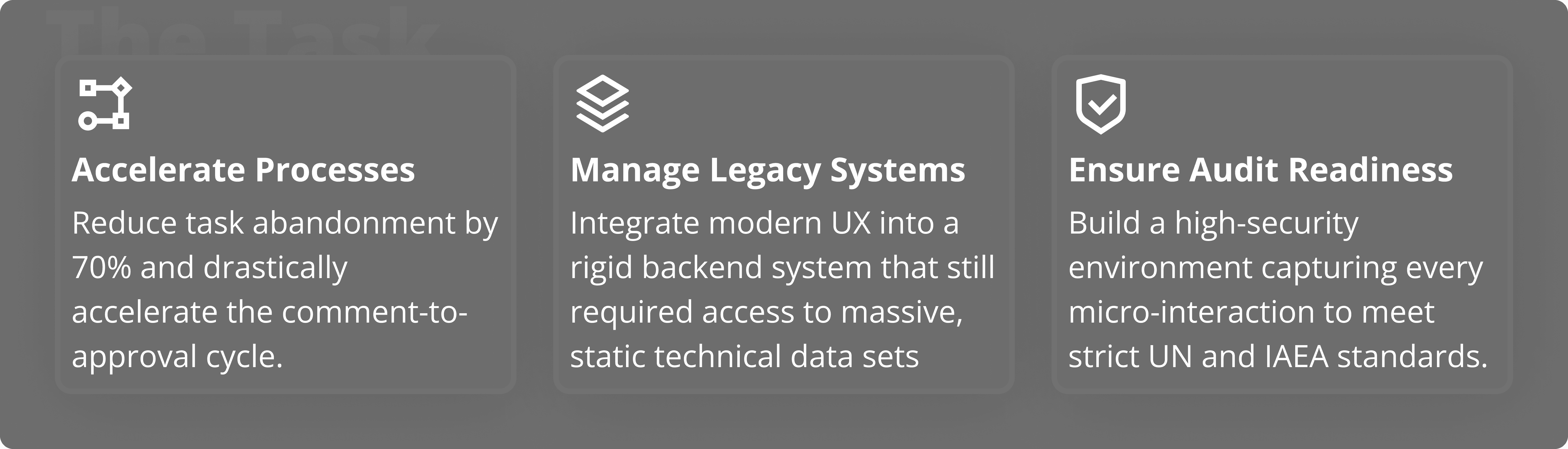
02. The Task
Building a digital vault that feels like a collaborative workspace
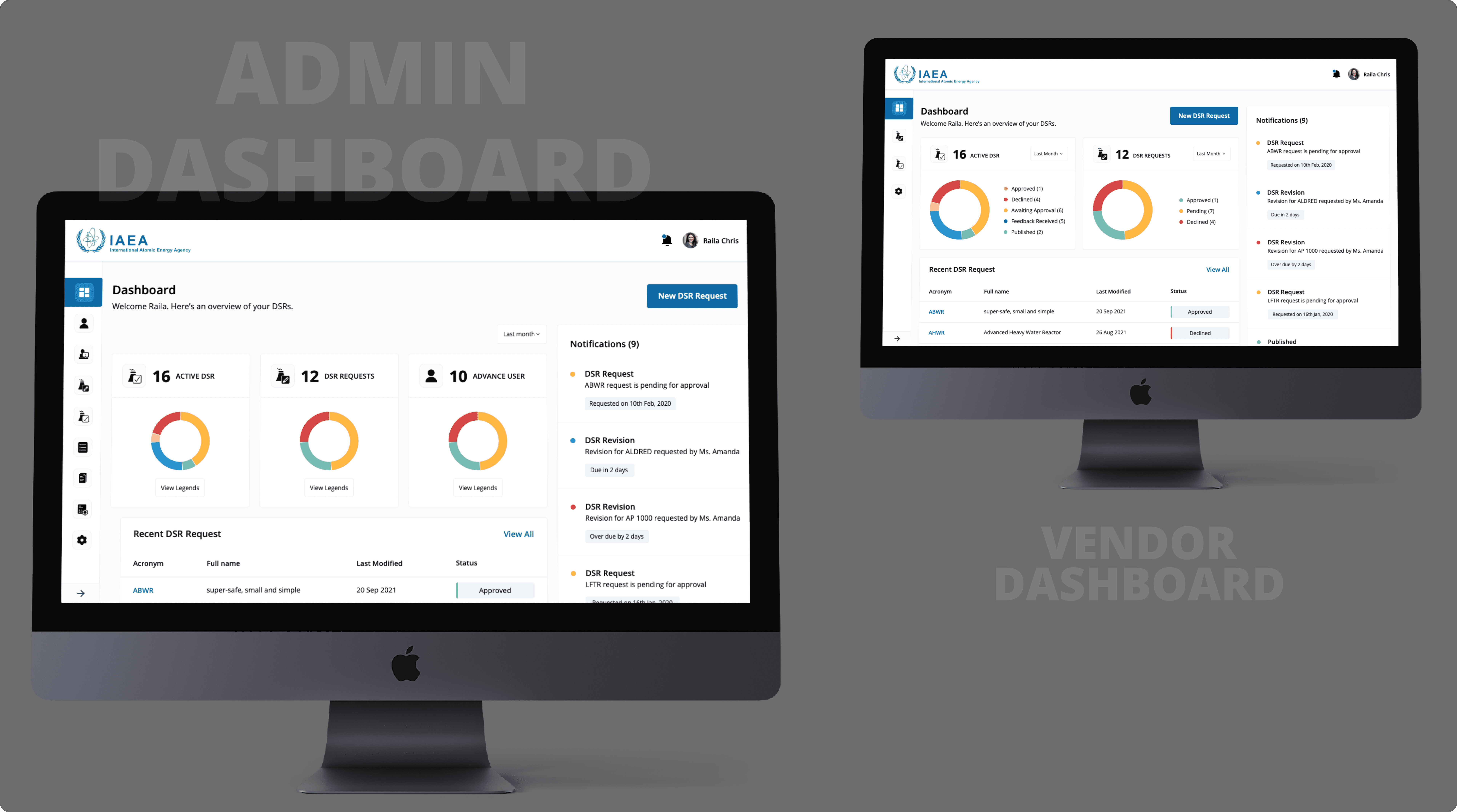
The objective was clear: transform the Advanced Reactor Information System (ARIS) into a streamlined, audit-ready platform. We needed a unified dashboard that satisfied two distinct personas: the "Time-Crunched Vendor" and the "Analytical Admin".
02. The Audience
Designing for dual realities
To build a successful ecosystem, we had to bridge the gap between two very different user mindsets with competing priorities.
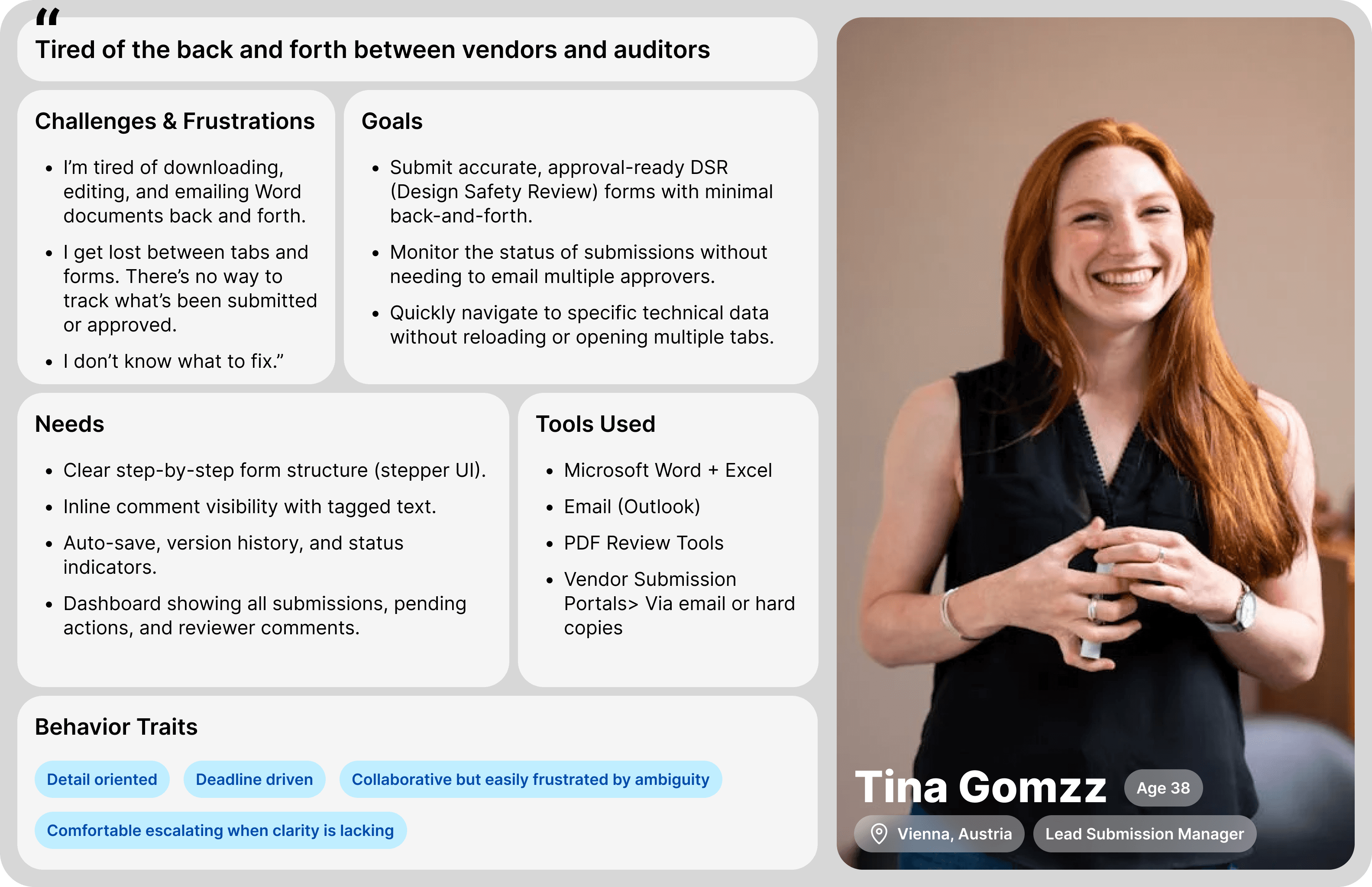
Time-Crunched Tina (Vendor Lead)
Needs fast form access. Values clear approval steps. Frustrated by “missing back buttons.”
Primary Goal: Submit & Comply Fast
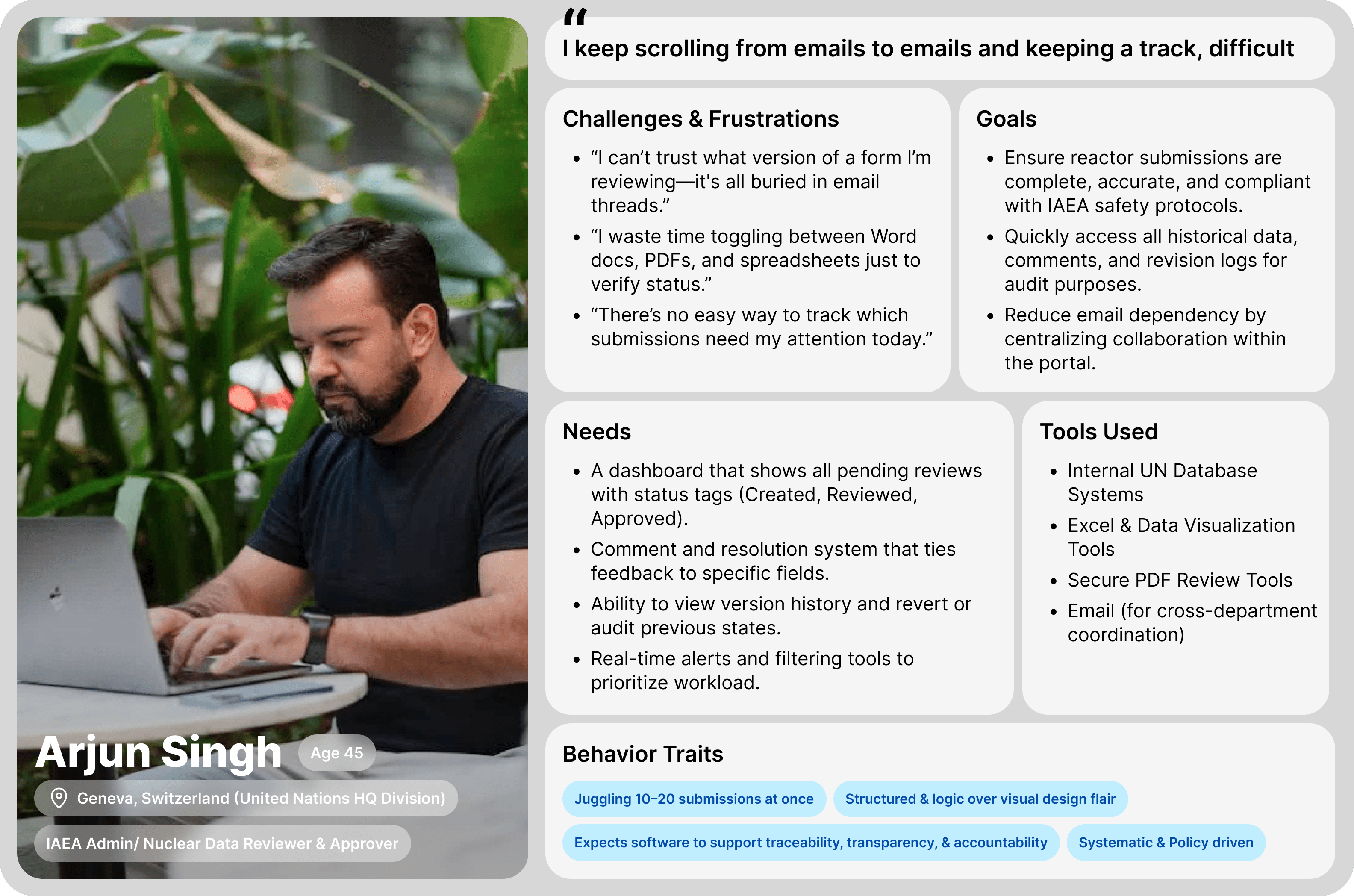
Analytical Arjun (IAEA Admin) Approves data from 30+ vendors. Wants version control + timeline view. Needs high traceability and a structured layout
Primary Goal: Rigorous Audit & Safety
03. The Action
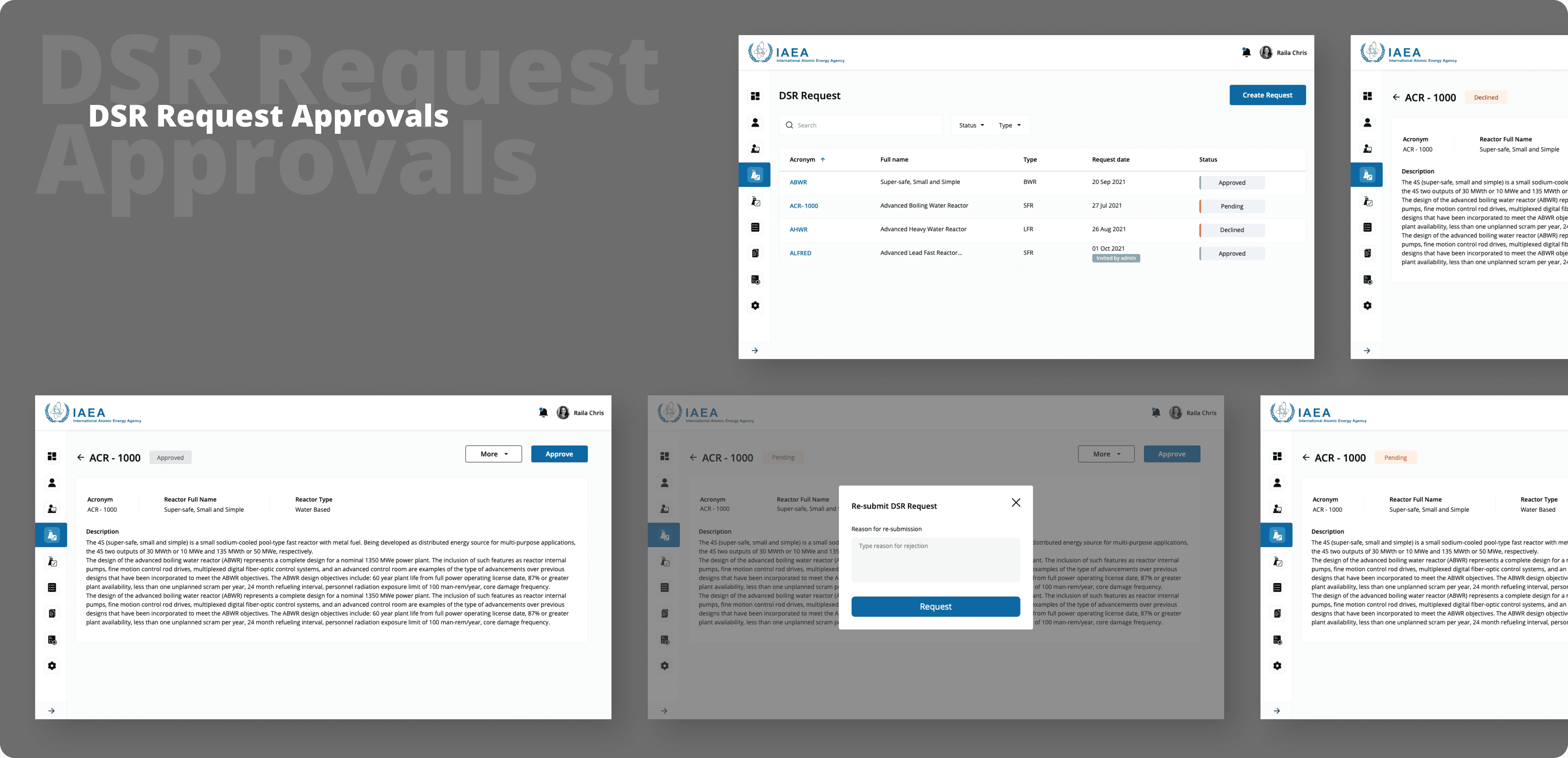
Replacing 20-page forms with a GPS-guided stepper & real-time annotation engine.

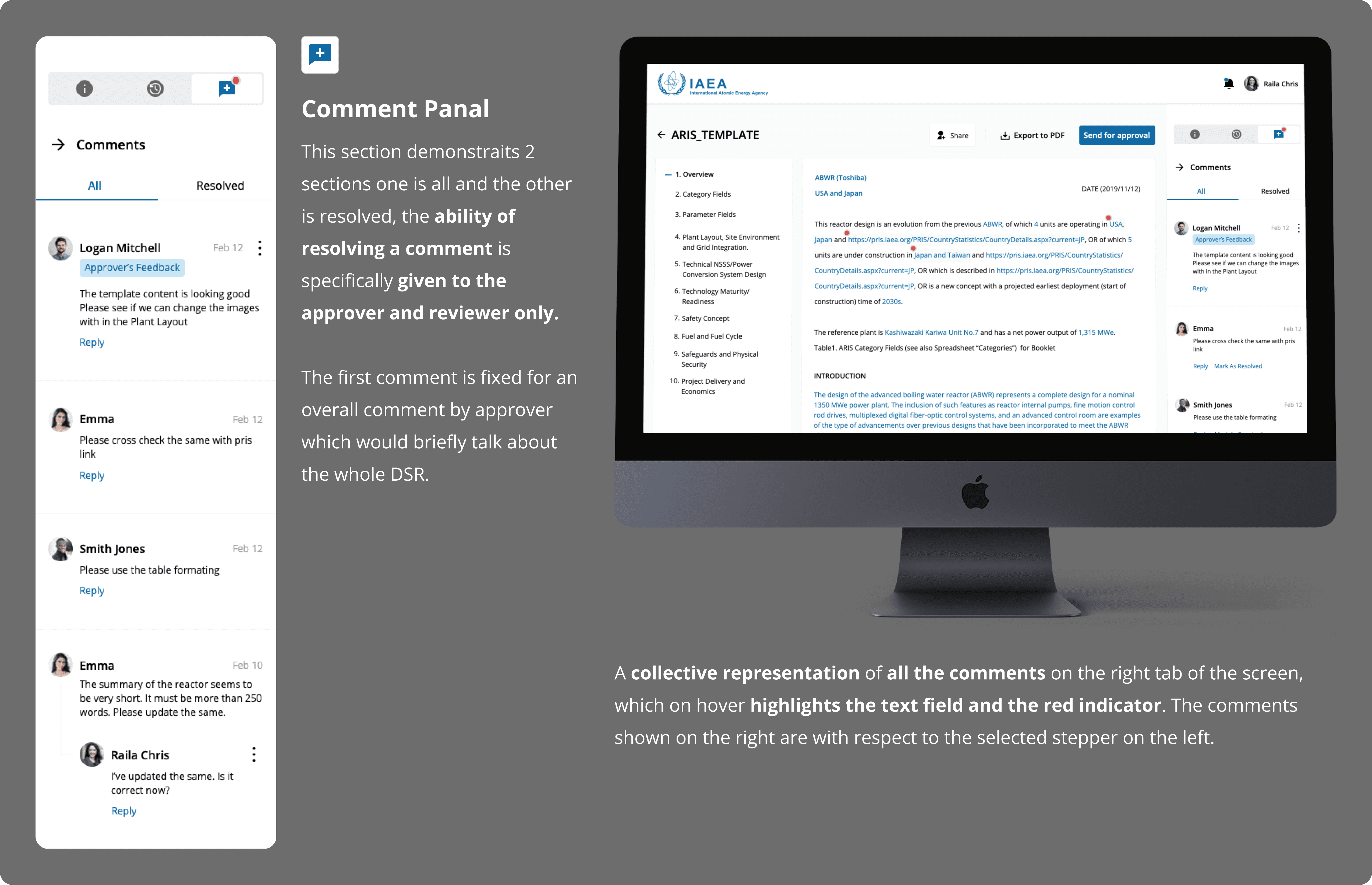
The Counterfactual Pivot
We initially explored an in-line pop-up system for comments. However, I discarded this in favor of a right-anchored comment log. Pop-ups created "cognitive friction" and hid the data being discussed; the anchored sidebar allowed for persistent context.
Overcoming Challenges
Testing revealed that "Tooltip Overload" was distracting users. I pivoted to collapsible Knowledge Cards to maintain a clean UI without sacrificing deep technical data.
Bridging the Gap
I translated complex heuristic audit findings, like "Visibility of System Status" failure, into business risks that policy experts could understand, working alongside lead architects to ensure the "Audit Trail API" captured every interaction.
04. The Result
Establishing the new UN Standard.
The Counterfactual Payoff
Choosing the anchored sidebar over pop-ups led to a 70% reduction in task abandonment. Users could finally see their comments and the form fields simultaneously.
Semantic Clarity
By unifying terminology (e.g., aligning "Vendor" vs. "Submitter"), we eliminated 100% of the semantic errors previously found in submissions.
Global Adoption
This "stepper-comment-audit" model was so successful that leadership adopted it as the standard UI framework for all internal UN data systems.
"I didn't just redesign a portal; I built a system of accountability that ensures the world’s nuclear data is as secure as the reactors it describes."
- Lead Product Designer