Designing the Nerve Center for High-Stakes Energy Operations
Redesigning a legacy simulation suite into a real-time, AI-assisted operations platform, where a missed signal can cost up to $10M.
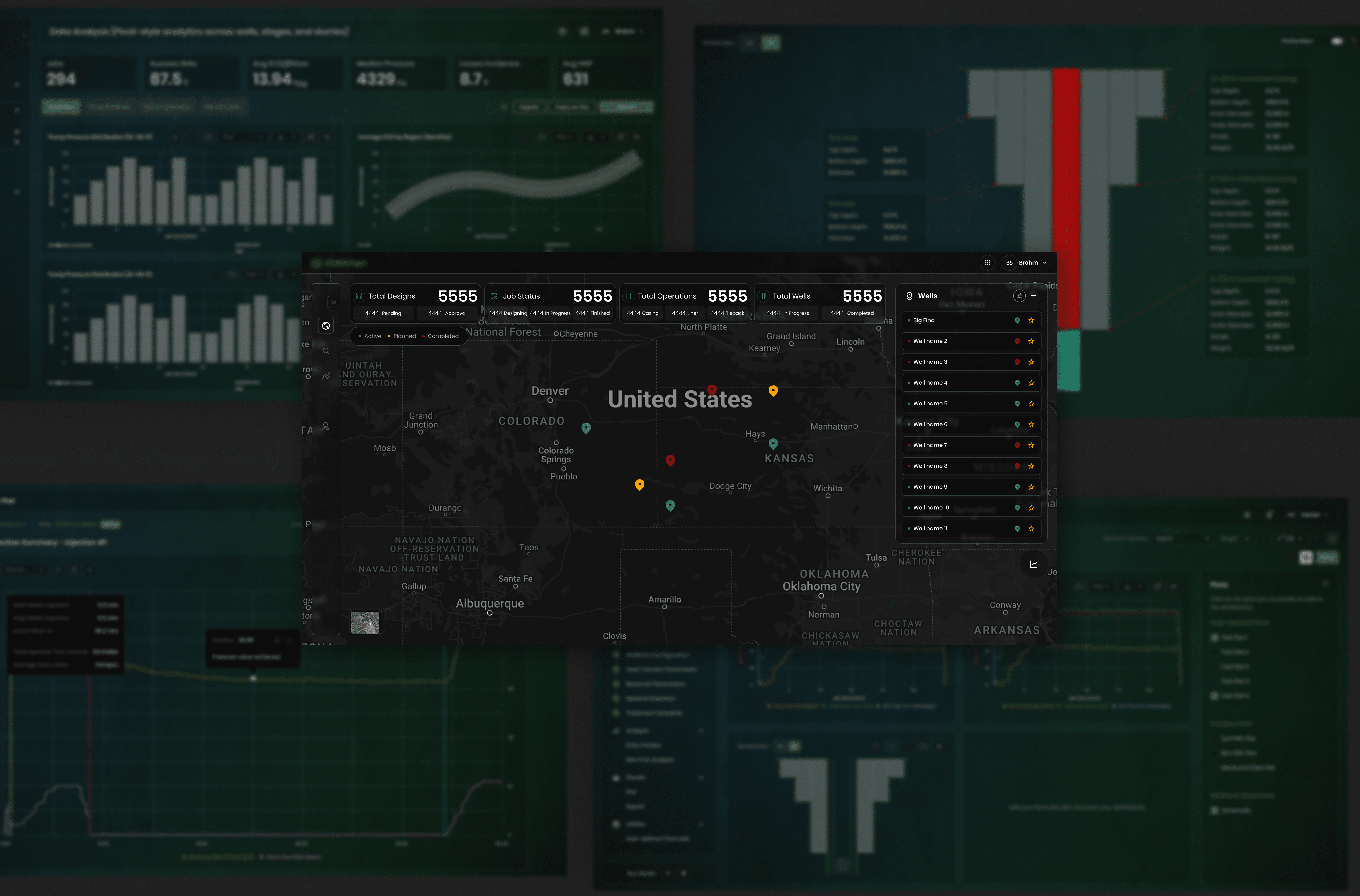
Role: Lead Product Designer Timeline: 14 months Industry: Energy / Industrial Operations Platform: Cloud SaaS, Control room and Field
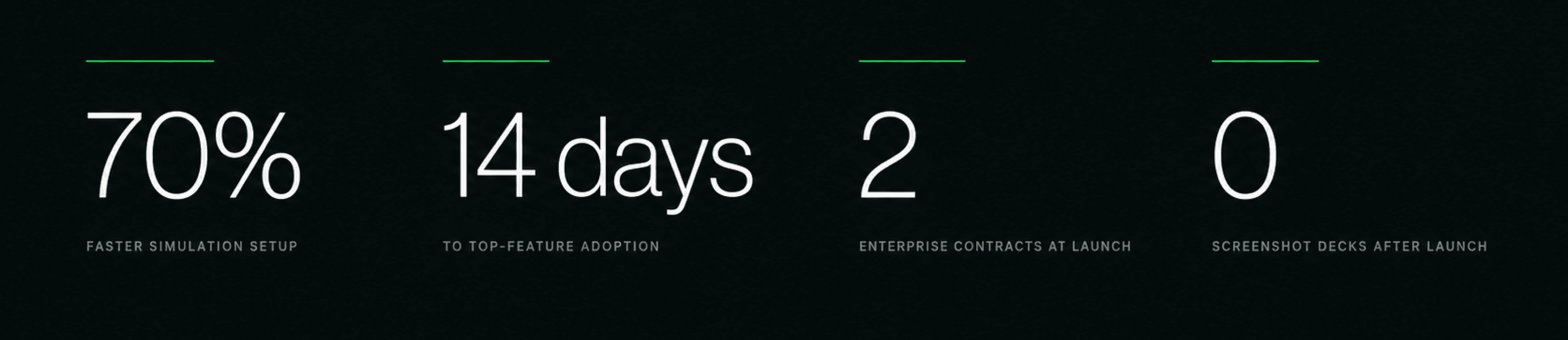
70% faster simulation setup 14 days to top-feature adoption 2 enterprise contracts at launch
The Challenge
Field operations in this industry run on live pressure data. When something goes wrong underground, engineers have minutes to react. A single missed event can clog a well. Cost per incident: $500K to $10M, before downtime.
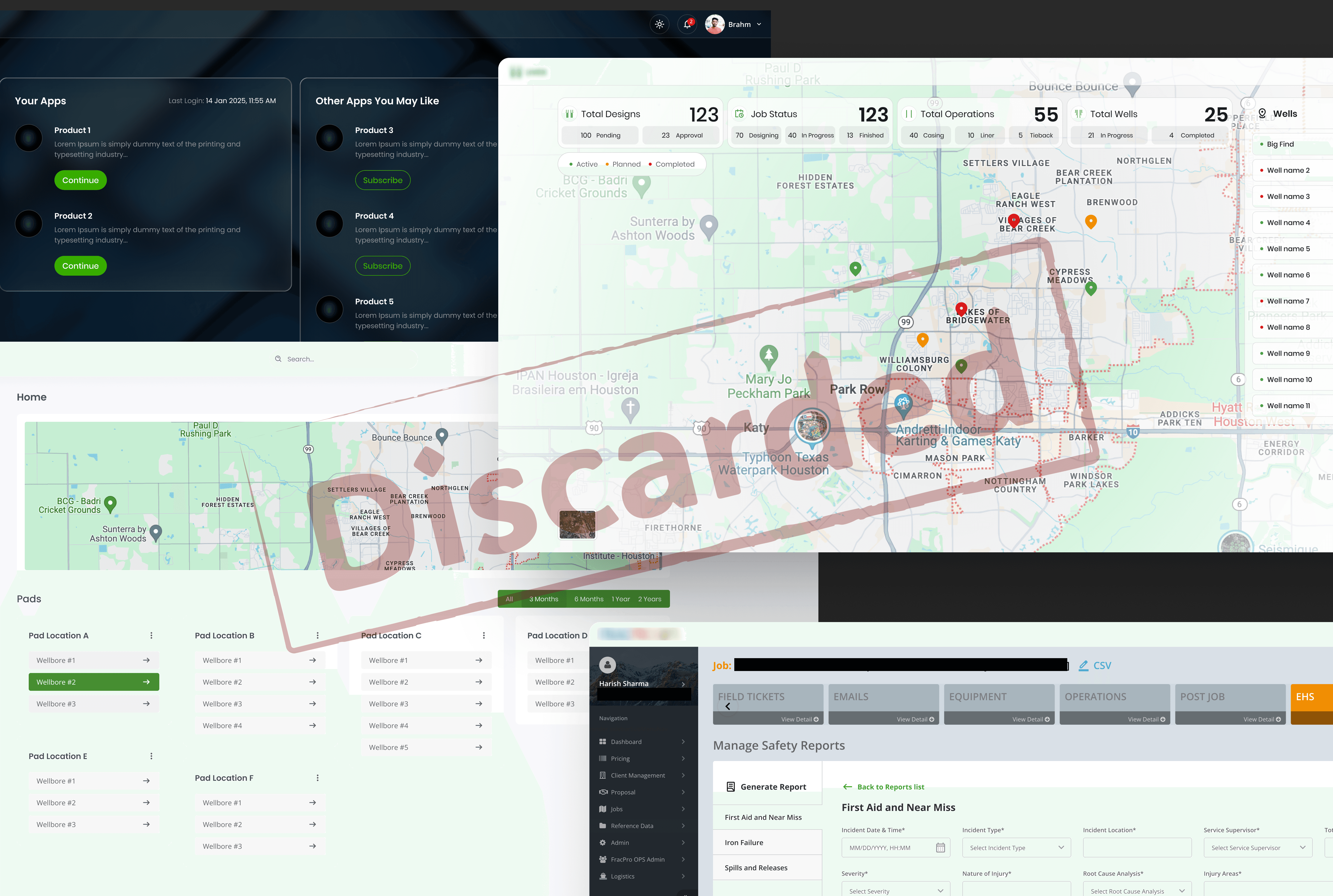
The tool they had was a desktop application built decades ago. The math inside it was trusted industry-wide. The interface was not. The single most important correlation in the whole workflow sat three tab-layers deep. Engineers understood the data fine. The screen just refused to show it in time.
The business was also pivoting. Leadership wanted a cloud platform that predicted outcomes with machine learning, not one that only displayed sensors. That raised a harder question. Why would an engineer with twenty years of physical intuition trust a model they can't interrogate?
This wasn't a redesign. It was a cognitive restructuring.

The Product Context
A short primer. Operators drill wells, then stimulate them in sequential stages. During each stage, sensors stream dozens of channels back to a trailer at the site and to analysts in remote offices. Rates, pressures, concentrations.
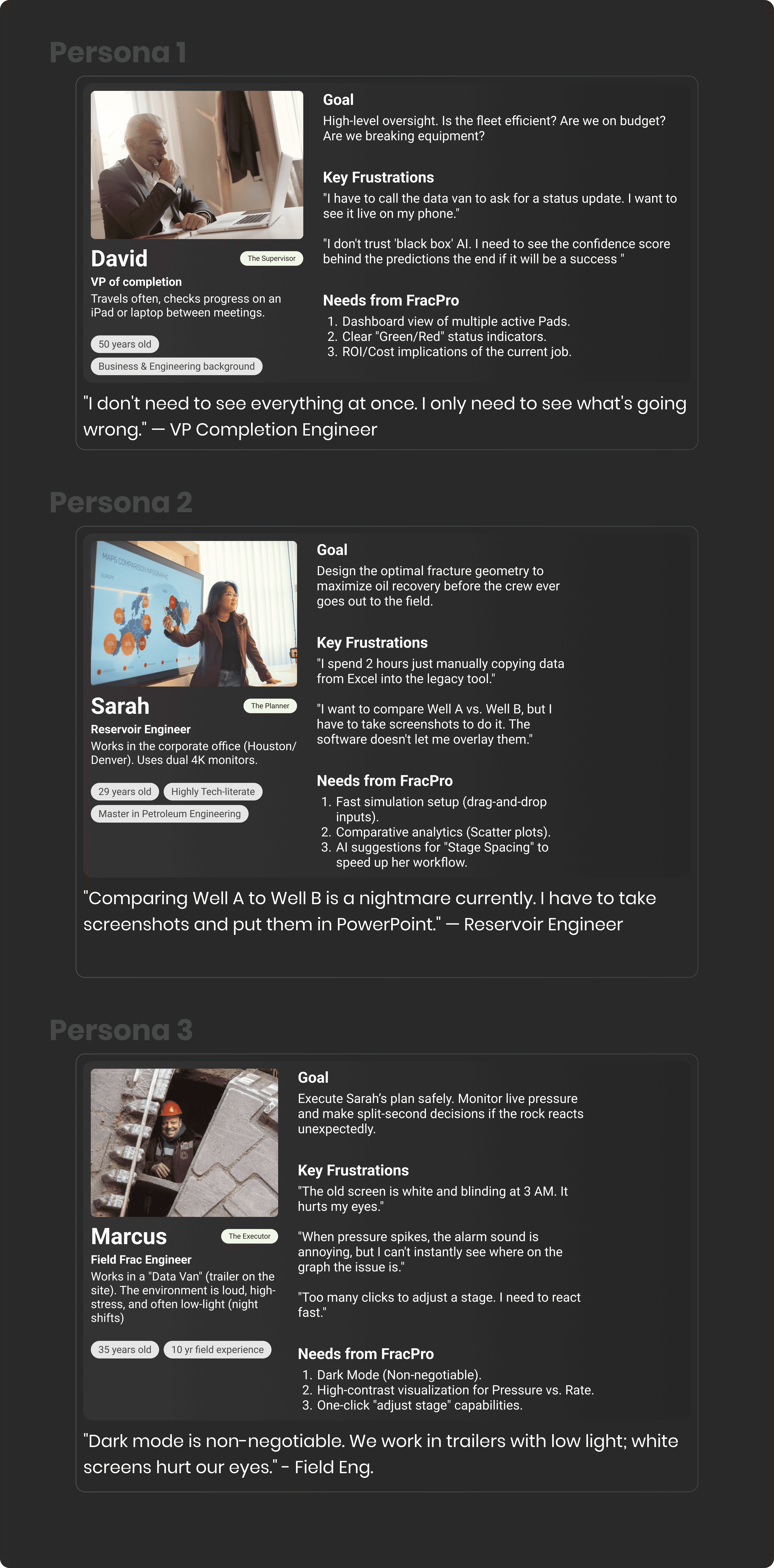
Two people watch the same data in very different conditions. A field engineer in a dark trailer at 3 AM, monitoring one live job. An office analyst in daylight, comparing ten wells at once.
The old tool served neither. It organised the world as files and folders. The people using it think in sites, wells, and stages. Physical geography, not a directory tree.
The Thesis
In high-stakes operations, clarity is a safety feature. Not a design preference.
Every decision below follows from that line. If a choice made the interface more impressive but the signal harder to see, it lost.
Strategic Decisions
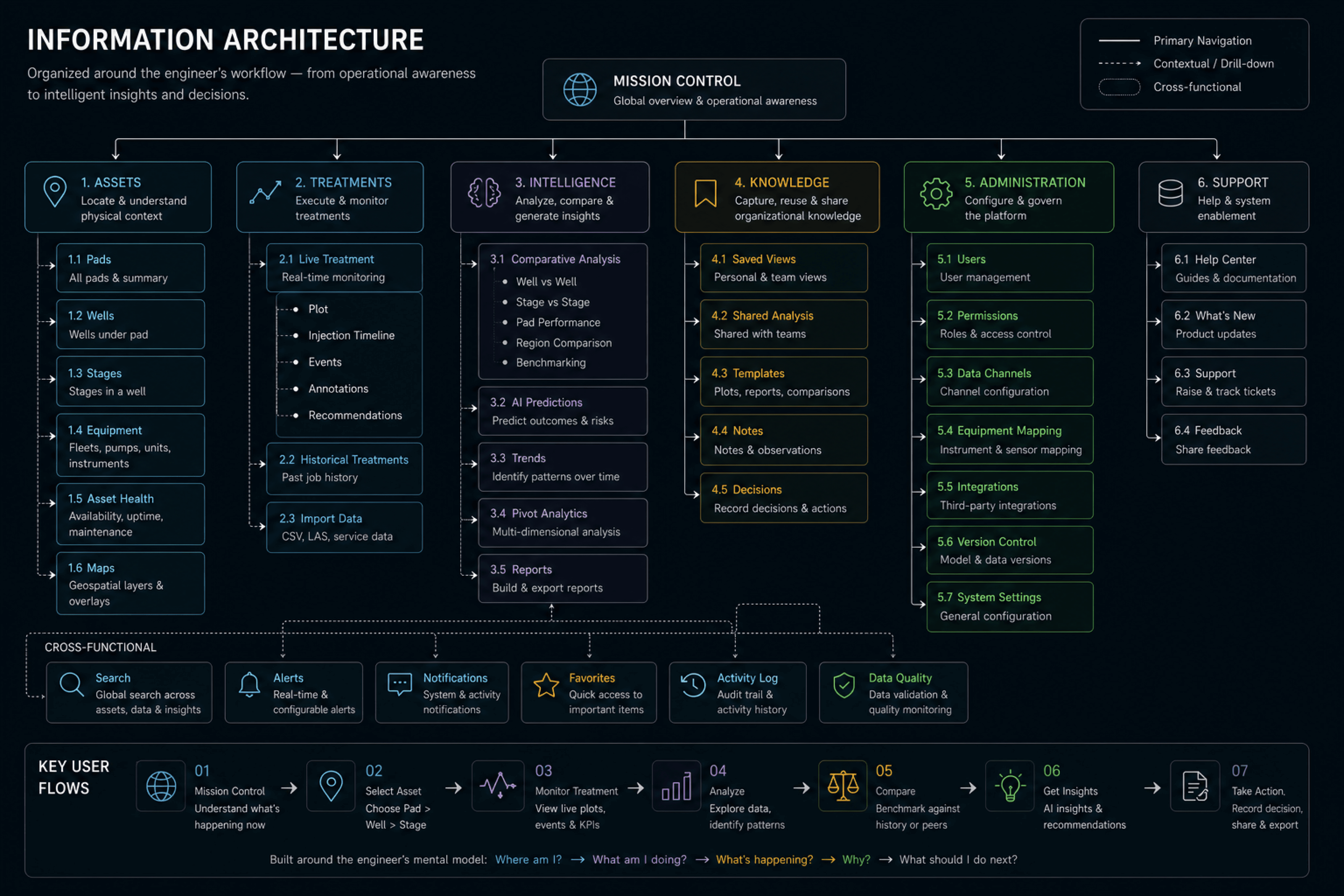
1. Geography over folders
The legacy IA mirrored the database. Engineers reason spatially: the north pad, well three, stage twelve. We rebuilt navigation as pads, wells, stages. Veterans had to unlearn old paths, which cost us some early friction. New users navigated without training, and support requests about navigation dropped to almost nothing.
2. Flatten the navigation, protect the graph
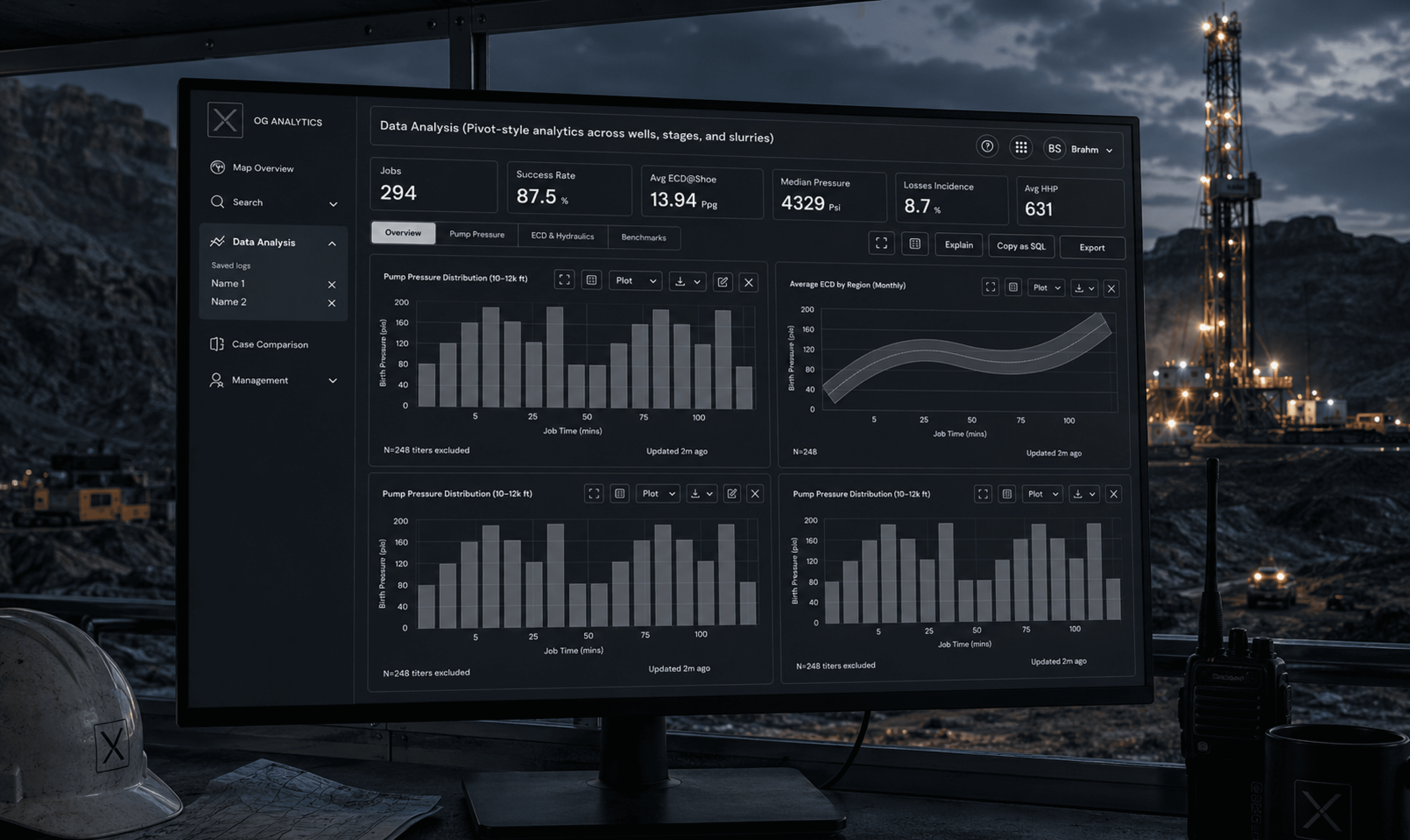
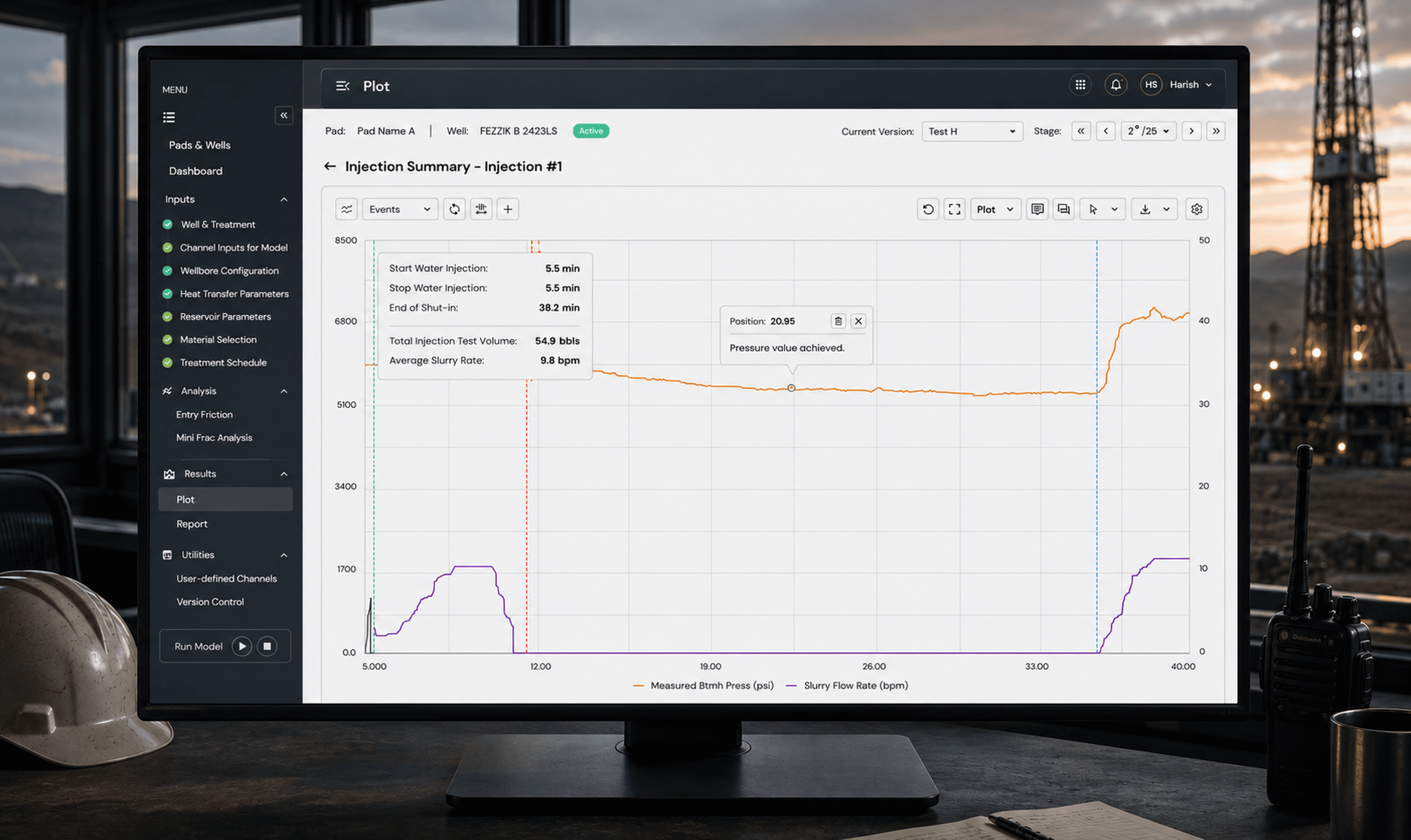
Nested tabs ate the screen. The pressure graphs, the heartbeat of the product, got leftovers. We moved to a collapsed left sidebar. Icon-only navigation took a release cycle to settle, but the plotting area grew enough for engineers to read longer time windows without scrolling.
3. Dark mode as a safety decision
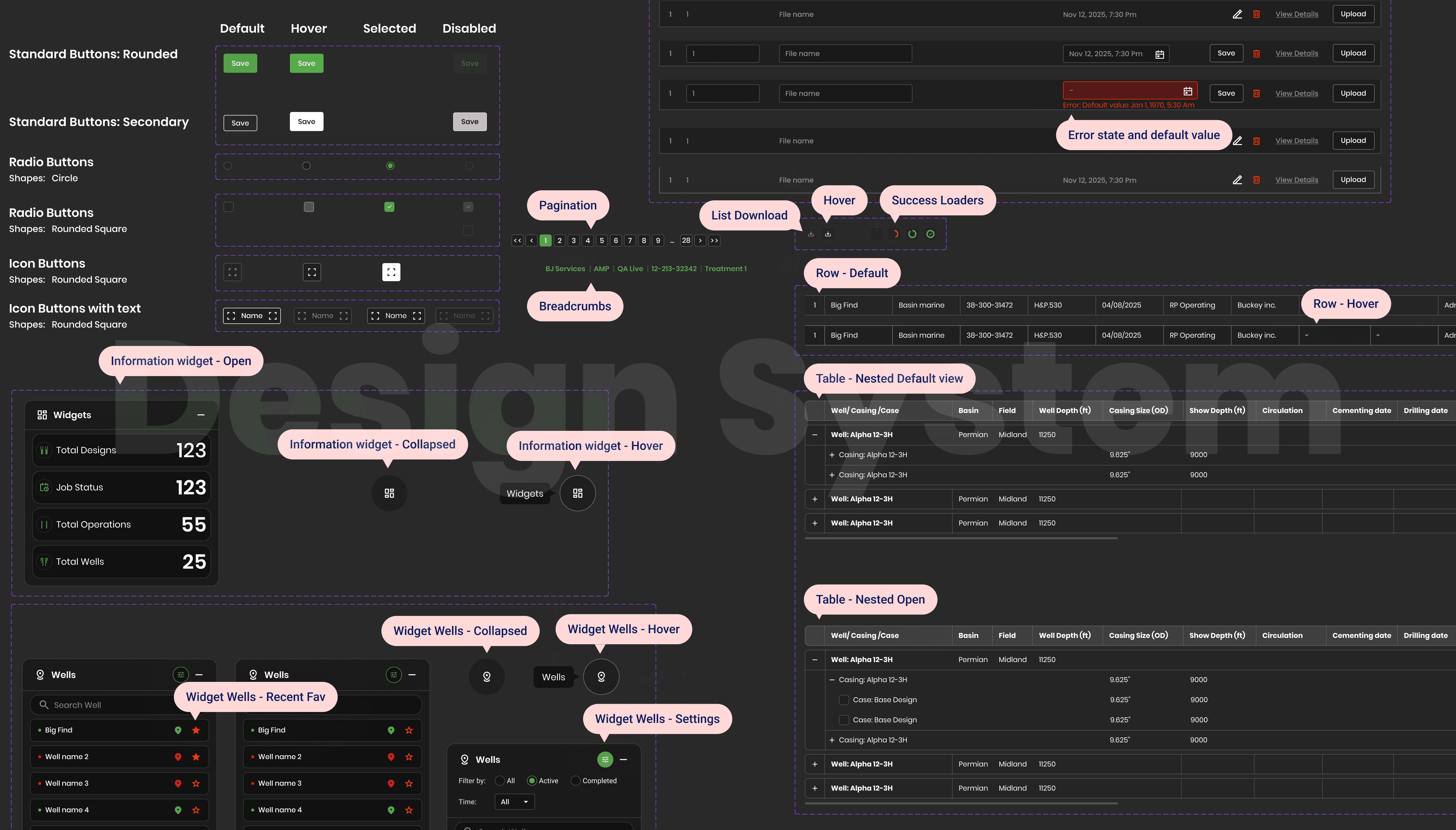
Field trailers are dark. A white interface at 3 AM means glare, eye strain, slower reactions. Not a style complaint, a hazard. We considered a light default with a dark toggle and rejected it. Dark-first forced stricter contrast discipline: one colour permanently owns rate, another permanently owns pressure, on every screen. Engineers read state peripherally, without reading labels.
4. Fix the intake before the output
Sensor channels arrived with fragmented vendor naming. Garbage in, confident-looking garbage out. No chart survives untrusted inputs, so we built a guided channel-mapping step. It adds setup time. It also became the platform's data quality gate and the main driver of the lower input error rate.
5. A timeline instead of a spreadsheet
Stage progression lived in lists that hid sequence and status. Stages are temporal, so we gave them a horizontal canvas. Long jobs stretch it, which meant adding compression and jump controls. The timeline ended up as the shared reference in daily operations calls. A coordination artifact, not just a screen.
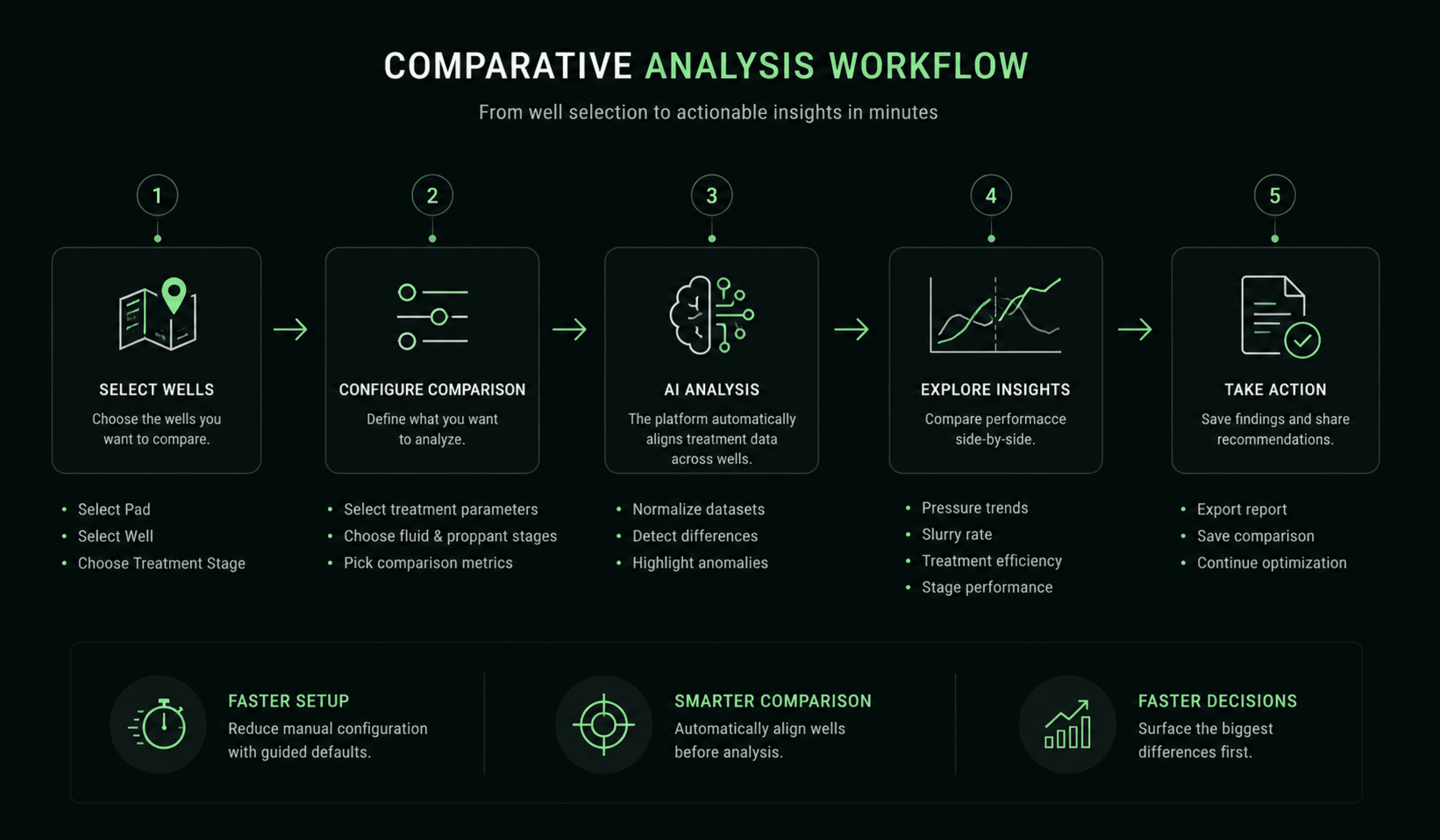
6. Comparison as a first-class workflow
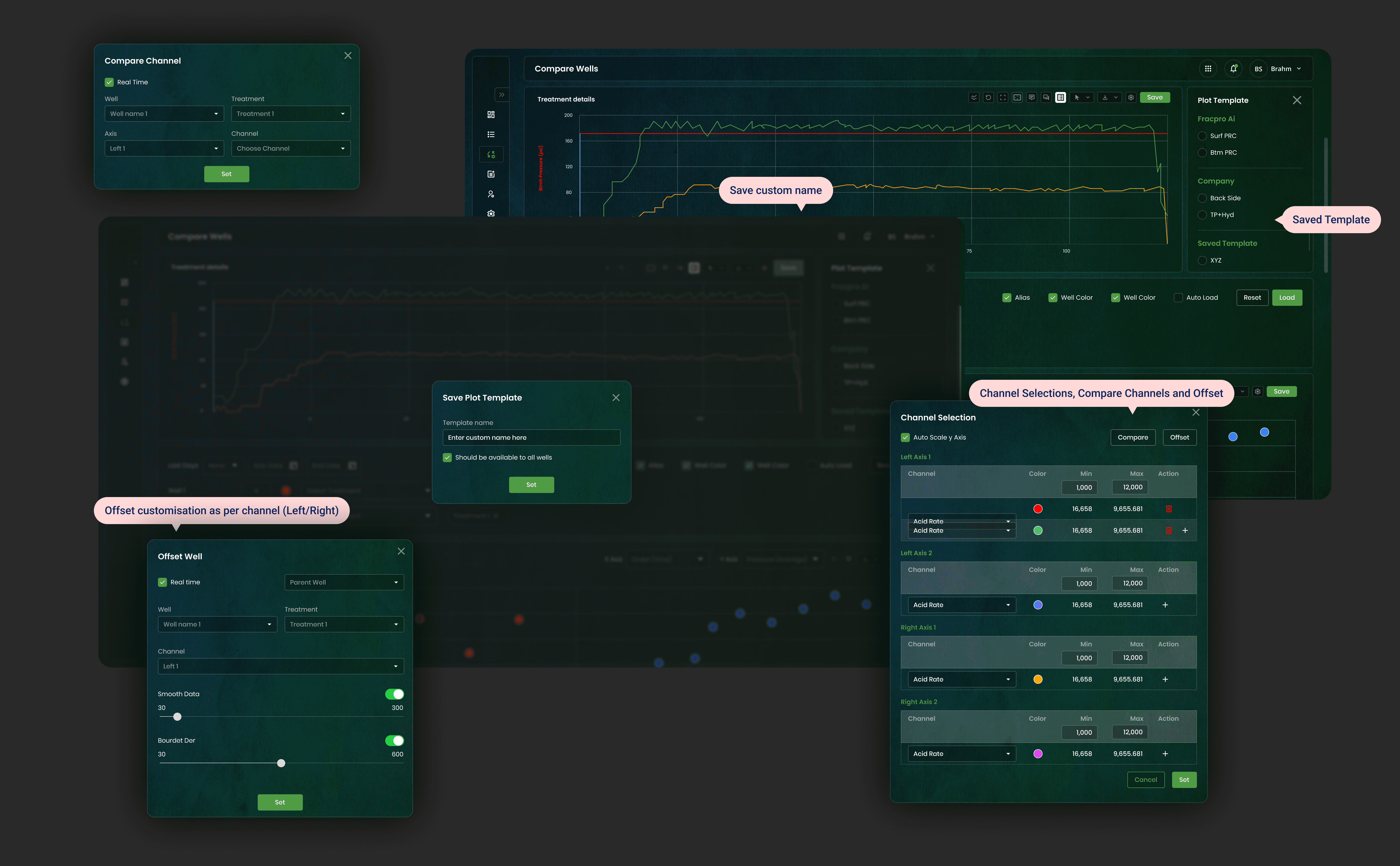
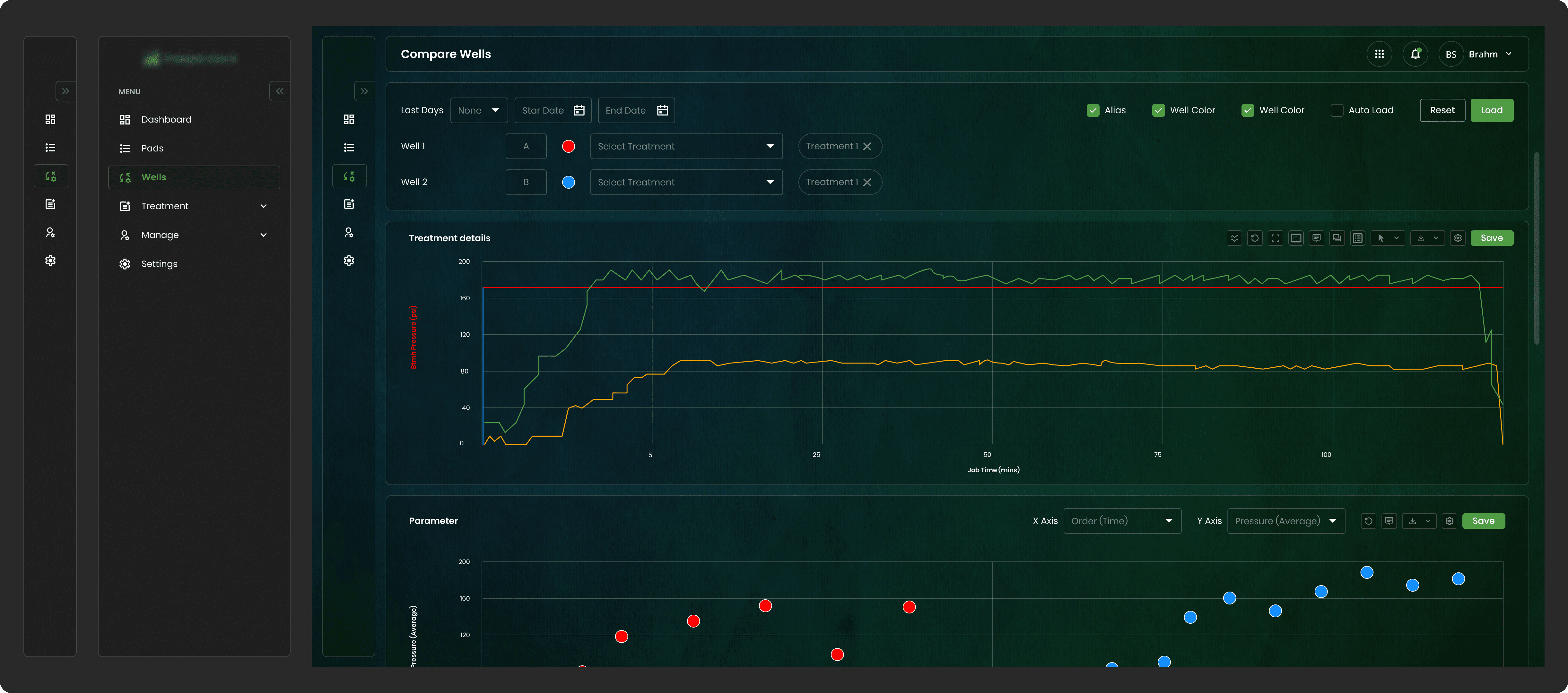
Analysts compared wells by stitching screenshots into slide decks. Hours of work, instantly stale. When users build a workaround that elaborate, the workaround is the requirement. True multi-well overlay meant solving axis scaling, color identity, and offset alignment. Deep, unglamorous plotting work.
The result: a pinnable comparison grid with saved configurations. Most-used feature in the product within 14 days.

7. Saved state as respect for expertise
Senior engineers configured the same plots dozens of times a week. Expert tools should accumulate expertise, so we shipped plot templates that persist and share across wells. Governance of personal versus shared templates added product complexity, but the templates quietly encoded team best practices into the product itself.
Designing Trust
The hardest interface in this project wasn't visual. It was the boundary between a human expert and a predictive model.
Research made one thing plain: engineers would not act on a prediction they couldn't check against raw data. So the principle became: the model advises, the human decides, the raw signal stays one glance away.
In practice:
Predictions never replaced measurements. Model outputs rendered beside live channels, visually subordinate to them. Every model-derived plot was labeled by source. Nobody could mistake an estimate for a reading. Where the model was uncertain, the interface said so. One interaction always led from any prediction back to the raw channels. Trust wasn't a launch feature. It was earned interaction by interaction, and it's what eventually let sales lead with the AI story instead of apologising for it.
Collaboration
This project had a translation problem before it had a design problem. Domain experts spoke physics. Data scientists spoke models. Frontend engineers spoke components and sockets. Nobody shared a language, so design artifacts became the common one.
Workshops ran on wireframes, not slide decks. A domain expert can point at a plot and say "that's wrong" faster than any requirements doc can capture it.
Real-time charting with live socket data is unforgiving, so I ran weekly desk checks with frontend engineers. Animation performance and pixel fidelity stayed honest. Drift got caught before it compounded.
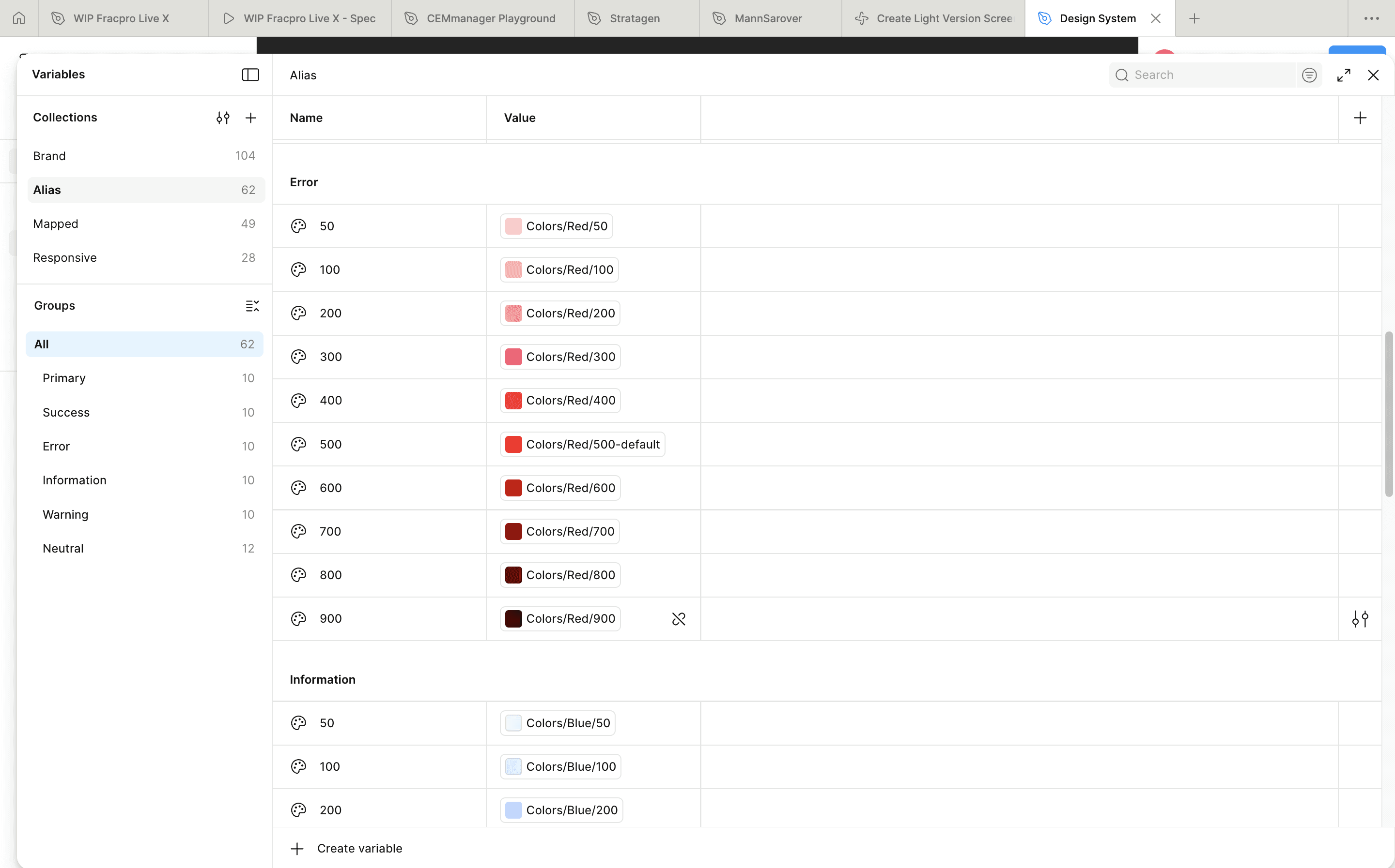
A tokenised design system made the build match intent without a review bottleneck. Handoff stopped being a phase.
The measure here isn't meetings held. It's that the physics team, the ML team, and the build team shipped one coherent product instead of three adjacent ones.
What We Didn't Build
The 3D visualization. We prototyped an immersive 3D view of subsurface activity as the primary interface. Spectacular in demos. In testing, engineers were blunt: the 2D graph is where the truth is. Their diagnostic vocabulary, slopes and inflections and divergences, is two-dimensional. We moved 3D to a later sales-facing phase and spent that budget on plotting depth instead. Utility beat theater.
The everything-dashboard. A configurable home surfacing every metric for every role. Killed. A dashboard that shows everything prioritizes nothing, which is the legacy product's failure rebuilt in a nicer font. We shipped role-anchored defaults with limited customization.
The light theme. We tried a light mode early, and the ground engineers rejected it almost on sight. In a dark trailer it washed out the plots and lit up the whole cabin. It survived one round of field testing before we cut it and committed fully to the dark-first system.
Automated intervention. At times the models were confident enough to suggest closing the loop and acting on their own predictions. We declined. In an industry with seven-figure and safety consequences, removing the human from the loop was a trust withdrawal the product couldn't afford. Decision support, not decision replacement.
Impact
Simulation setup time fell 70%. The channel-mapping gate cut errors at the source, which meant the models trained on cleaner data. An upstream design decision paying off downstream in ML performance.
The comparison workflow became the most-used feature within 14 days and killed the screenshot ritual entirely. When a feature replaces a workaround that fast, you've found real demand.
The platform secured two major operator contracts right after launch and carried the company's shift to subscription SaaS. The trust architecture around the AI let sales lead with prediction as the headline.
The design system collapsed handoff friction. The shipped build was a faithful twin of the design intent, and feature velocity rose because teams composed from the system instead of redesigning per screen.
If I Redesigned This Today
I'd make the AI conversational. Engineers form hypotheses in language. "Show me every stage where pressure diverged from plan" should become a plot, with the same provenance rules intact.
I'd instrument attention, not just clicks. We optimised layouts from interviews and observation. Telemetry on what engineers actually watch during live jobs would let the interface earn its real estate from evidence.
I'd design the shift handoff. The 3 AM engineer and the 7 AM engineer share a well but not a context. What happened, what to watch. An unsolved, high-value seam.
I'd push personalisation past templates. The next step is a product that learns an engineer's diagnostic habits and quietly pre-stages their view.
Interfaces don't prevent million-dollar mistakes. Attention does.
The job in products like this is deciding where a person's attention goes in the three seconds that matter, and making sure that when they look, they can trust what they see.
That's not interface design. That's building the cognitive frame for high-stakes decisions.


