Scaling one system across eight products.
The Team
As the Lead product designer for an oil & gas tech team, I led the creation and implementation of a unified, token-based design system built to serve the entire PVI ecosystem, from field crew interfaces to office engineering dashboards.
Design System Architecture | Token Nomenclature | Component Design | Dark Mode System | Multiple Products
Background
A cloud-native platform for hydraulic fracturing operations.
The company builds tools that streamline the most complex field operations in oil and gas: hydraulic fracturing, well stimulation, and real-time data acquisition. Their product suite spans from 0 to 1 lifecycle and 1 to 100, comprising 8 different product lines.
Each product had its own design patterns, inconsistent spacing, and no shared visual language. As the ecosystem grew, so did the cost of maintaining separate UI approaches; engineers had to context-switch across tools that felt disconnected.
Challenge
Fragmented tools slowed engineers in critical operations.
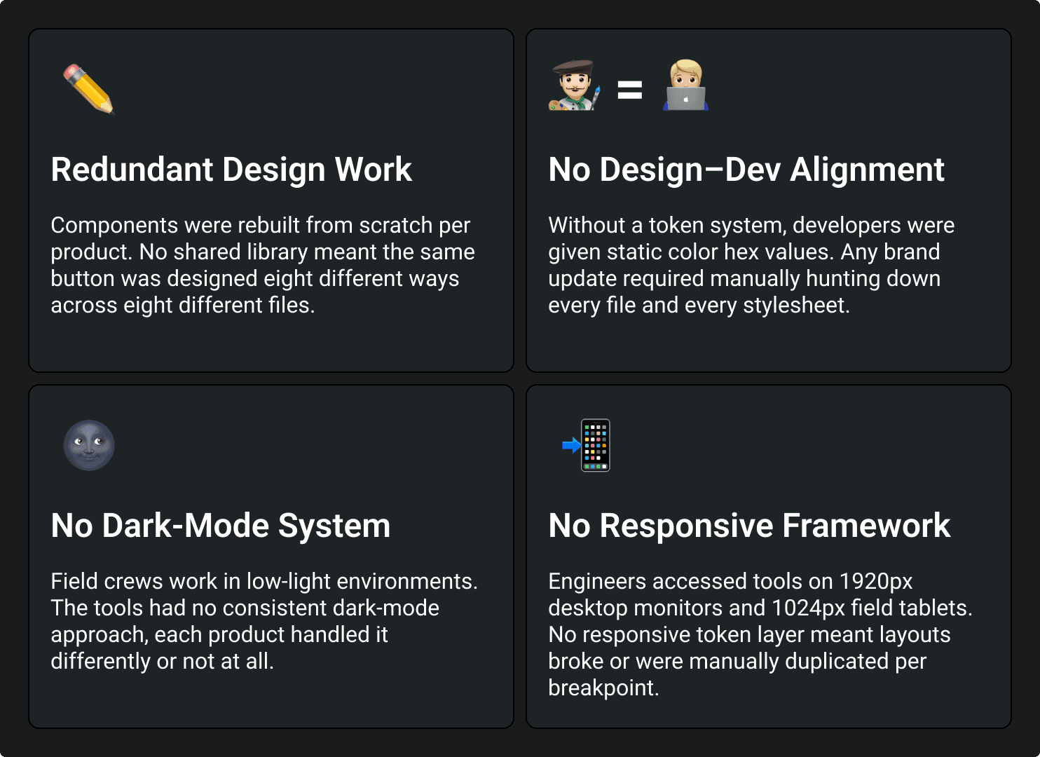
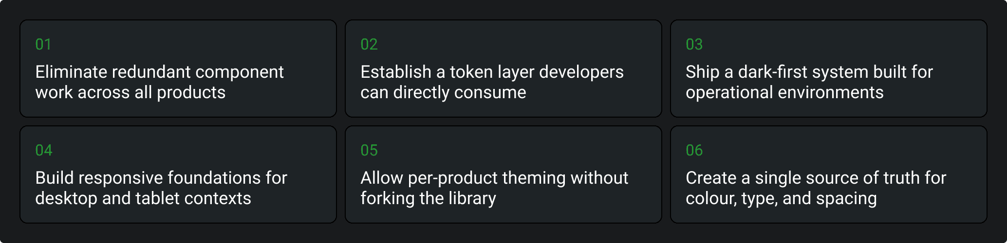
With 8+ products under one roof and no shared design language, designers duplicated their efforts across every product. Field engineers jumped between tools with inconsistent UX. Developers had no token system; every change required manual updates across products.
Objectives
Enter the Design System
Token-based, dark-first, built to scale across the full PVI ecosystem.
The Design System is a pre-built, platform-agnostic, token-based system engineered for duplication and per-product customisation without ever breaking the shared foundation.
Crafting the Design System Architecture
Step 01: Research & Analysis
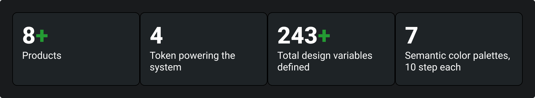
Audit existing products. Identify patterns, inconsistencies, and shared behaviours across the PVI suite. Conducted a thorough audit across products to identify recurring UI patterns, spacing inconsistencies, and redundant component logic. Gathered inputs from developers on handoff friction. The audit revealed 7 shared component categories being duplicated independently across all 8 products.
Step 02: Token Architecture
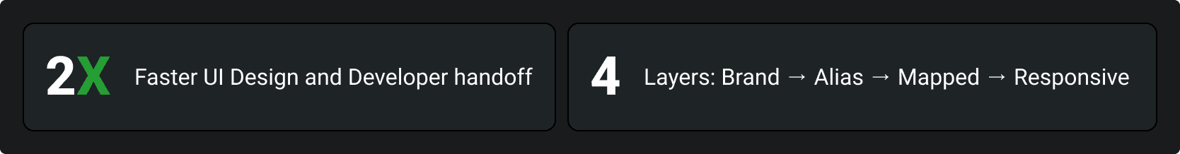
Design the 4-layer token architecture: Brand → Alias → Mapped → Responsive.
Planned a layered token structure where brand tokens hold raw values, alias tokens assign semantic meaning, mapped tokens bind to component roles, and responsive tokens adapt to device contexts. This allows per-product theming by only changing the brand layer; the rest propagates automatically.
Step 03: Laying the Foundation
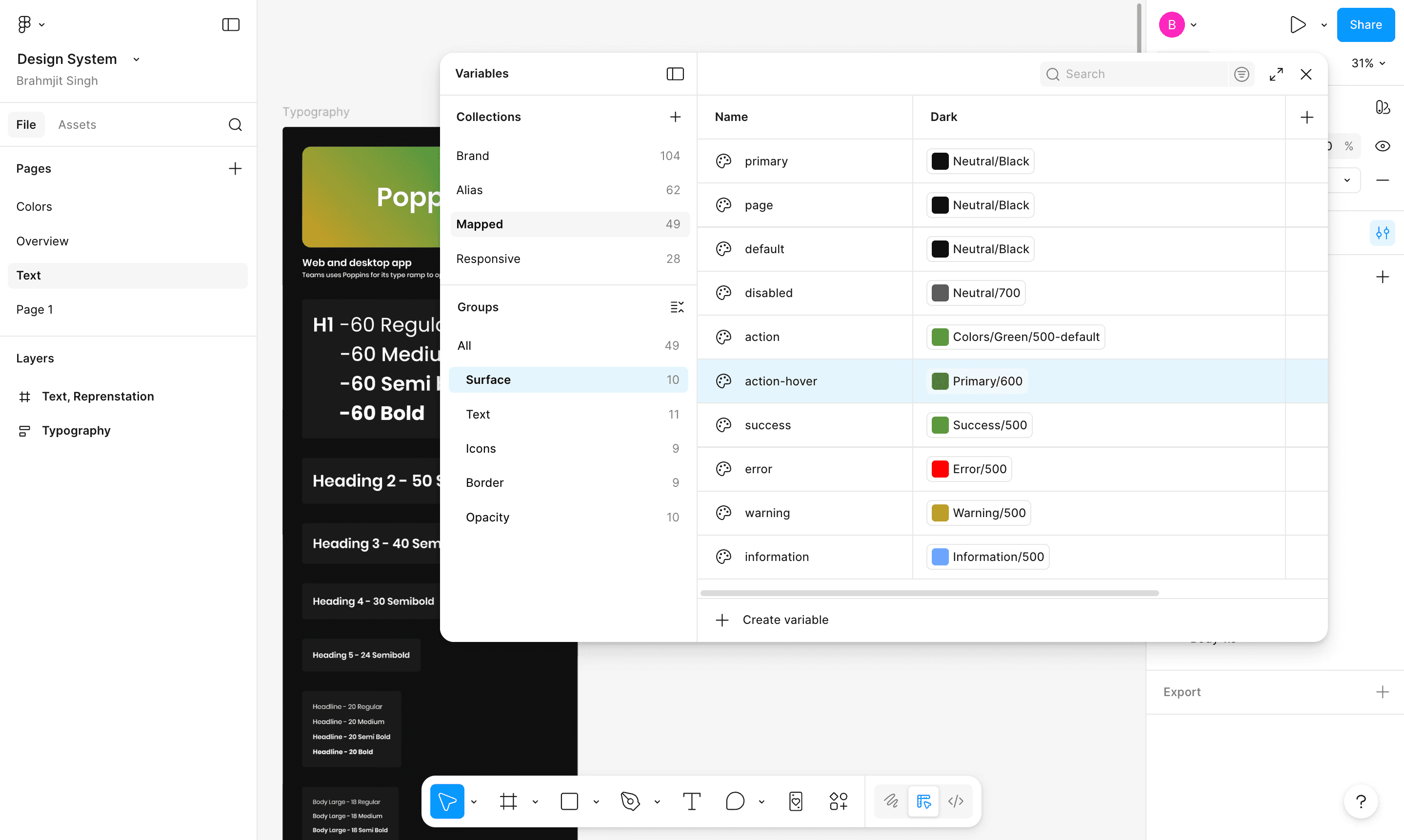
Using Figma variables to define the full token system colours, typography, spacing, and responsive breakpoints.
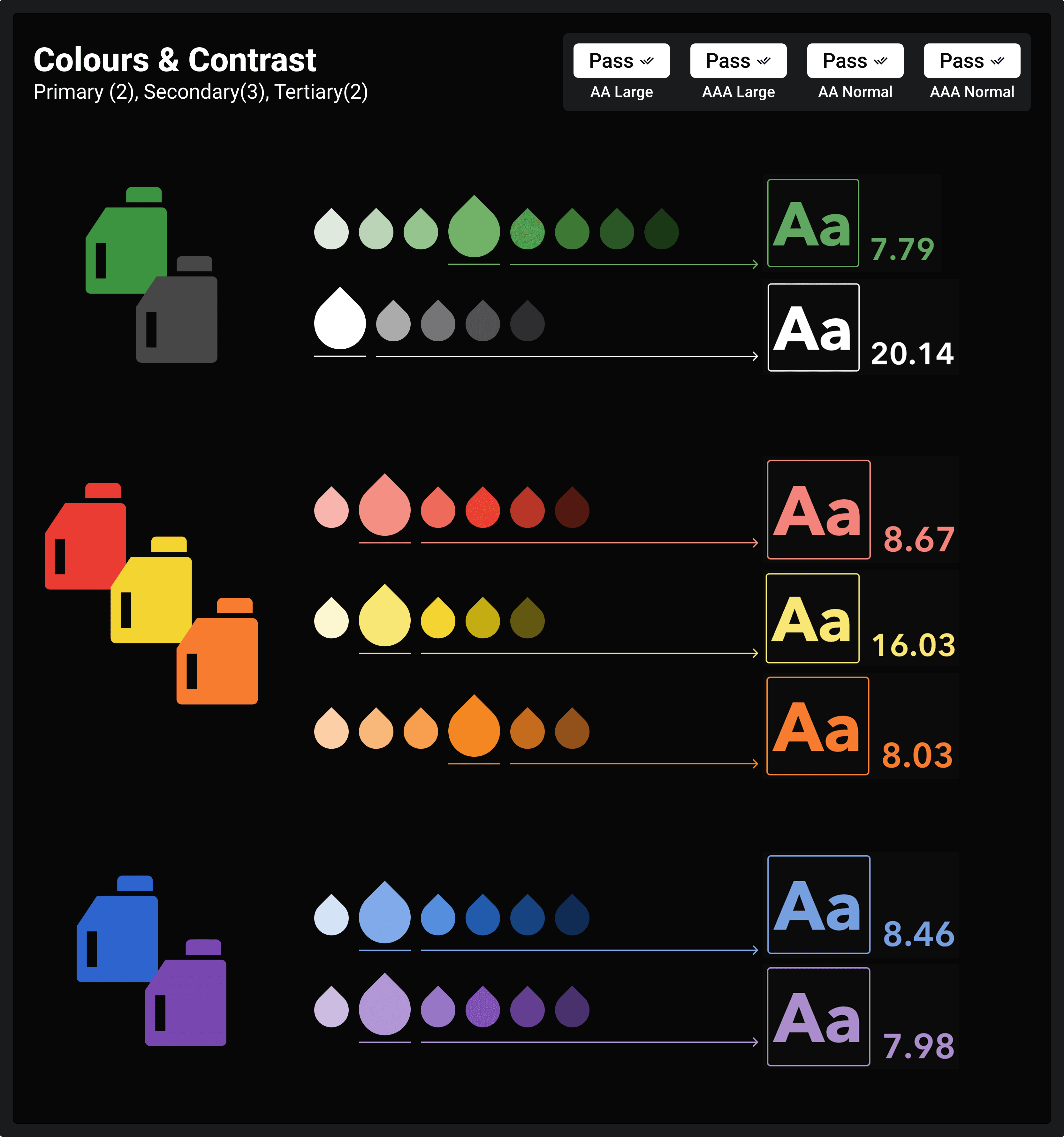
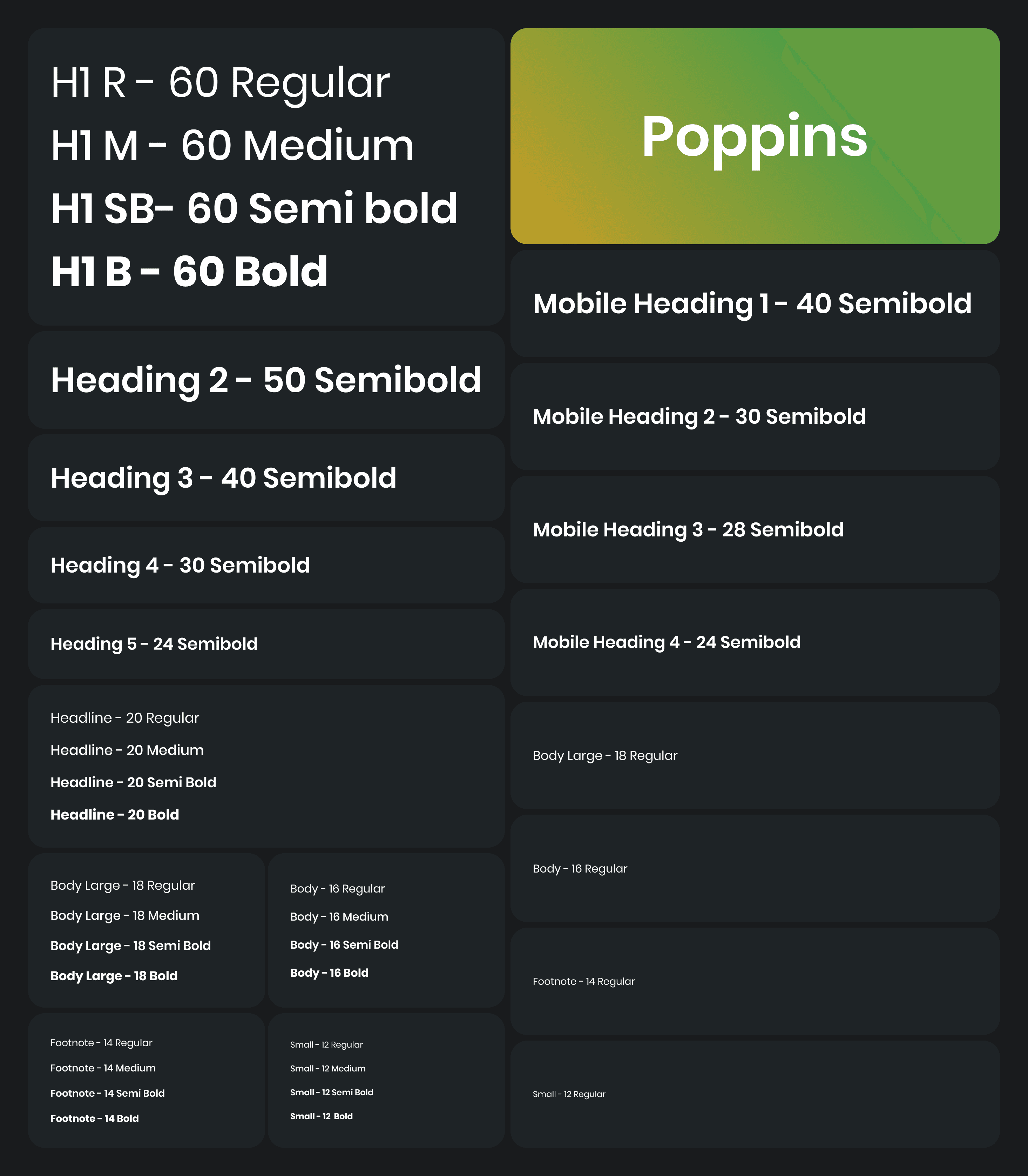
Built the entire token system natively in Figma variables with a dark mode column across all collections. We defined 7 colour palettes with ramps for all the edge cases, 1 typeface (Poppins), 4 weight scales, and responsive type scale values. H1 = 60px desktop, scaling down to 48px on tablet via the responsive collection.
Type Scale
Step 04: Developer Coordination
Finalise the design dev integration approach with engineering teams.
Worked with front-end developers to establish a token export and sync pipeline. Figma variables export JSON files, which map directly to CSS custom properties and JS theme objects, enabling dark mode, product theming, and breakpoint-responsive values to be consumed programmatically without manual intervention on every change.
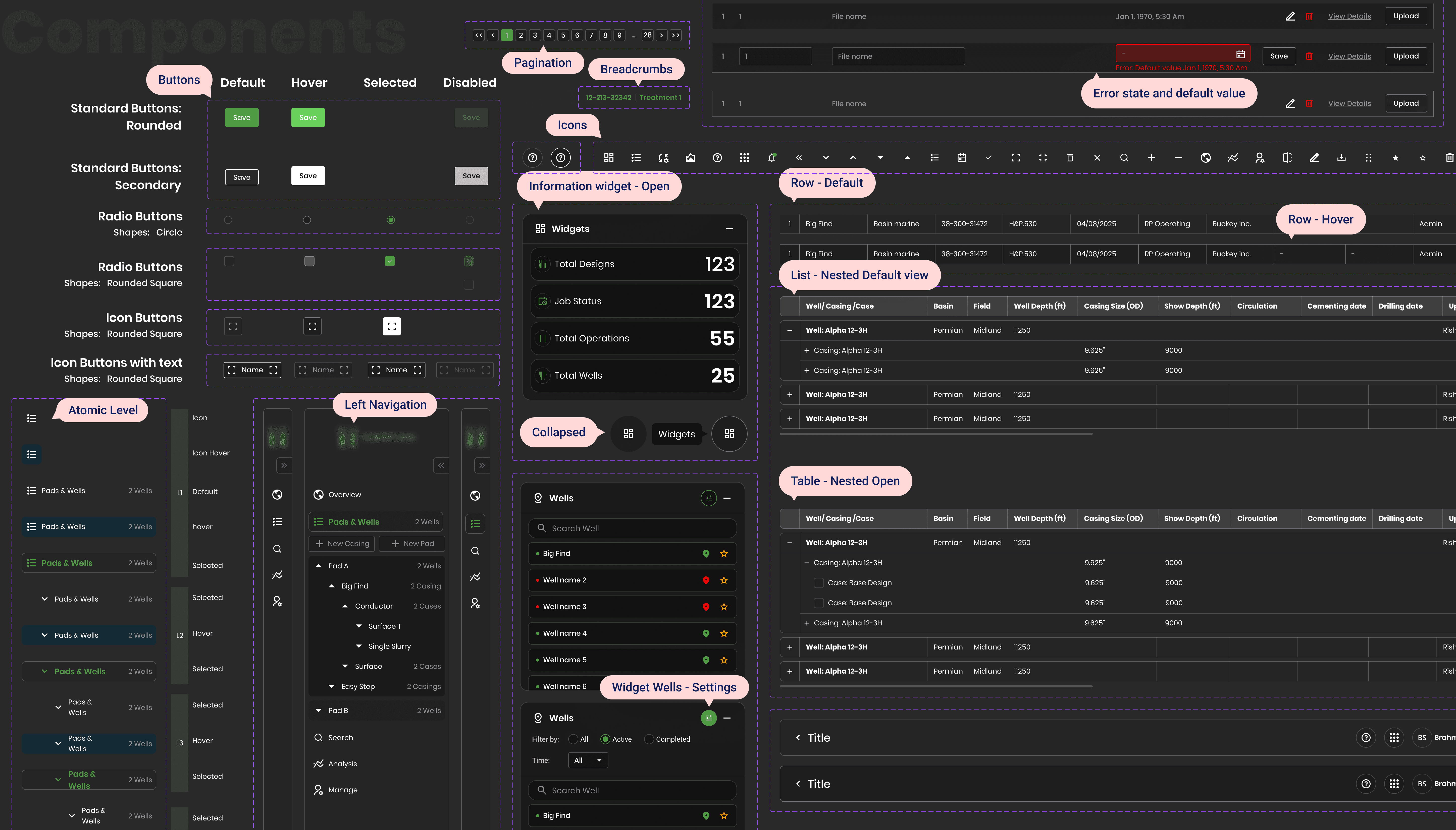
Step 05: Testing Across Products
Test the system on real product screens, frac job dashboards, pumping schedules, and activity logs.
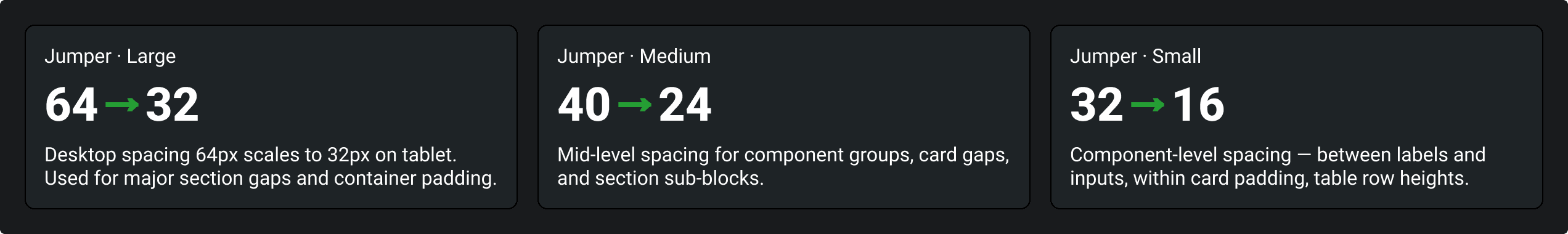
We applied the design system across actual product screens in different products, verifying colour contrast ratios in dark mode, table density on a tablet, and component behaviour across the jumper scales (64–32, 40–24, and 32–16). Iterated on spacing, text sizes, and component states based on real-world layout feedback.
Jumper Tokens
Space multiplier tokens that define spacing jumps between desktop and tablet breakpoints, keeping layouts proportional across device sizes without manual overrides.
Step 06: Educate on Usage
Document guidelines, token naming conventions, and component usage rules for the wider team.
Authored usage guidelines covering when to use each token layer, how to extend the system for a new product without forking the library, naming conventions for the Brand → Alias → Mapped chain, and component variant rules. Conducted walkthroughs with product stakeholders and developers.
Step 07: Adoption & Rollout
Roll out the system across the product suite, serving as the single source of truth for all eight products.
Deployed the system as the shared design foundation across all platforms and brandings. Each product only overrides brand-layer tokens to express its identity; all components, spacing, and typography inherit from the shared alias and mapped layers, ensuring visual consistency without design duplication.
Lesson lernt
Reflections & key takeaways
Naming is the hardest part of a token system.
Getting the Brand → Alias → Mapped naming chain right took far longer than building the components. Names that feel obvious in isolation become ambiguous at scale. Invest deeply in nomenclature before laying a single component.
Dark-first is a constraint that makes you a better designer.
Designing dark-first forces you to think in terms of elevation and light emission rather than shadow and depth. It improved every colour decision, because contrast had to earn its place rather than be assumed. Light mode, when added, was better for it.
A design system only works if developers trust it.
The token architecture was only as effective as the dev-side adoption. Spending time with engineers early, understanding their codebase, how they consume variables, and what format works for them, was the decision that made the system actually ship.